Manage your finances with ease
Simple payments came with second guesses.
A crowded home screen and fragmented payment flows made routine financial tasks feel complicated.
- UX Designer & Researcher
- 2 months
- Money Management App
- 29s median time to make a payment
- FigmaReact NativeXcode
The app gets used in the small gaps of the day: paying a bill on the bus, checking whether a transfer landed, splitting dinner. My job was to make those moments quick without making them easy to get wrong. So the app now has five clear tabs, one Pay and Transfer flow instead of several, and copy that says what is actually about to happen. Before any money moves you see the amount, the fee and when it will arrive, and you can undo it. Fewer mistakes, faster payments and more people finishing setup were the things we watched.
I ran interviews and watched people use their existing banking apps, then turned that into personas and journey maps. Those guided low-fidelity wireframes, which we tested and retested against three questions: is it clear, is it safe, and how long does it take. I worked closely with engineering throughout on what was actually feasible inside the bank's payment rails and compliance rules.
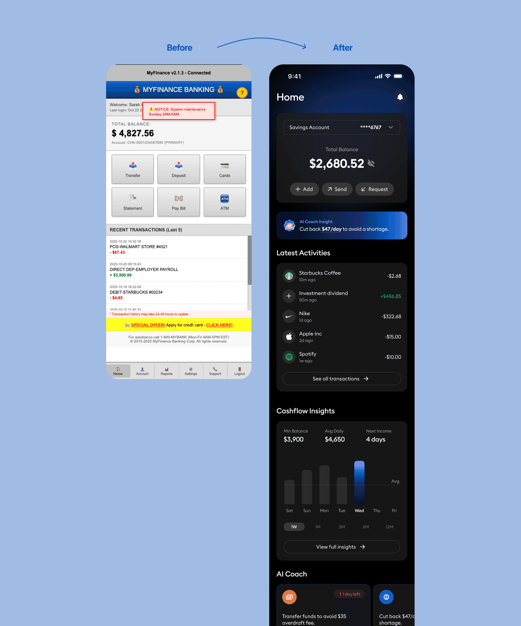
The old Home screen showed everything at once: balances, transactions, insights, goals and alerts, all shouting equally loudly. People would land on it, pause, go back and forth between sections, and mostly ignore the insights because nothing told them what to look at first.
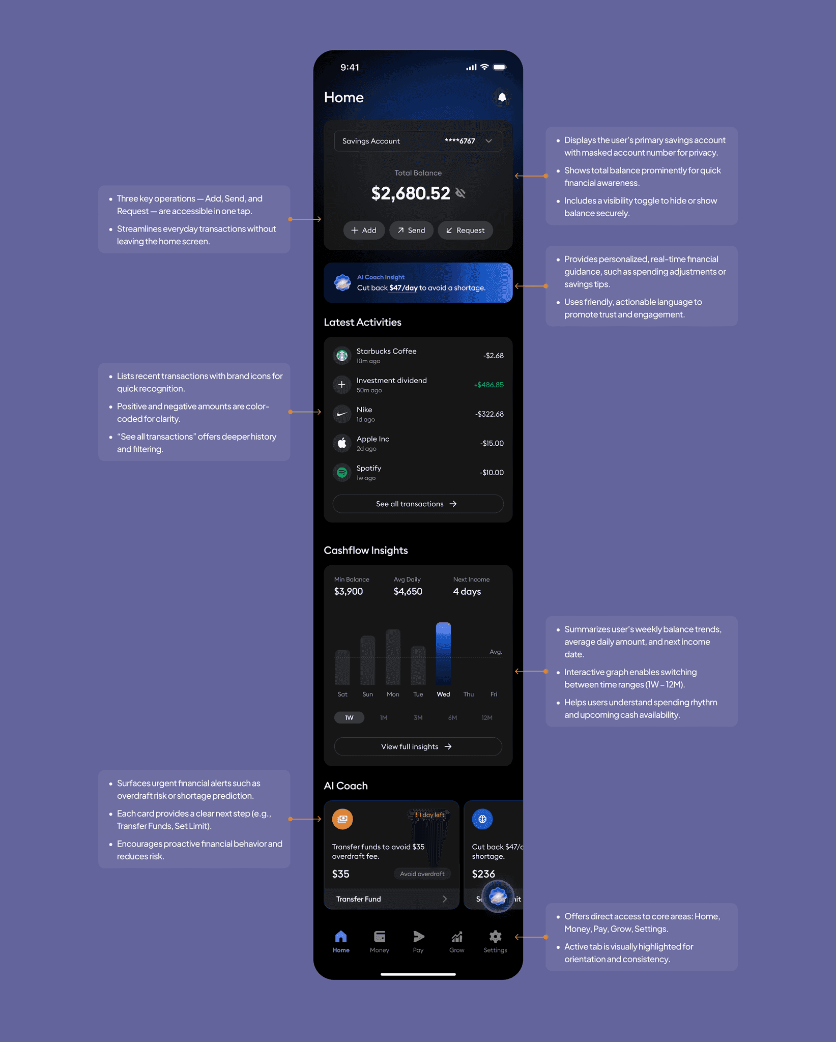
The new Home has one clear starting point. Your balance sits at the top, Add, Send and Request are right there, and the insights are written as something you can act on rather than something to skim past. Everything else waits its turn.
- The interface lacked a clear hierarchy; users struggled to identify primary actions such as transfers or deposits.
- System alerts and promotional banners cluttered the screen, distracting from essential banking tasks.
- Visual inconsistency in color, typography, and iconography created a dated and untrustworthy appearance.
- Key information like balance and transactions was buried among unrelated details, causing cognitive overload.
- The layout provided no actionable insights: users viewed static data without meaningful context or guidance.
- A defined hero section now surfaces the total balance and key actions (“Add,” “Send,” “Request”) for instant clarity and engagement.
- Clean, structured layout and spacing establish a strong visual hierarchy, improving readability and reducing fatigue.
- AI-powered insights transform raw data into actionable guidance, supporting smarter financial decisions.
- Consistent color palette and typography enhance brand trust and modernize the overall look.
- Streamlined navigation and contextual feedback reduce friction, allowing users to complete core actions quickly and confidently.
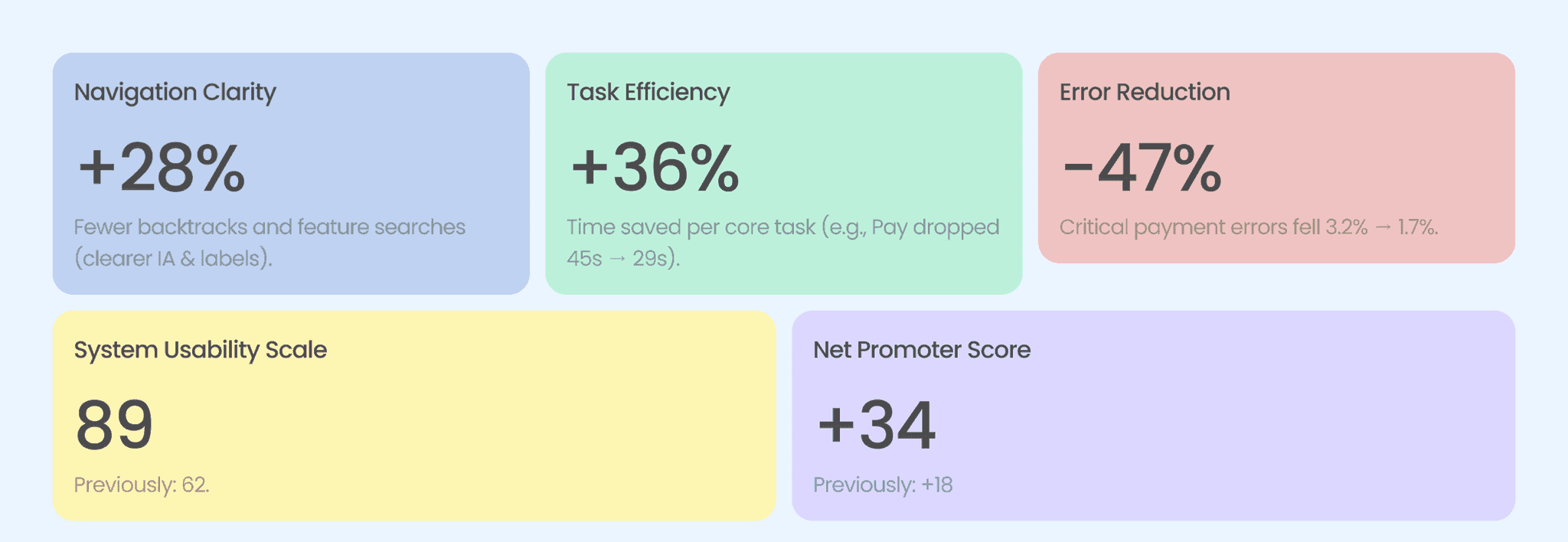
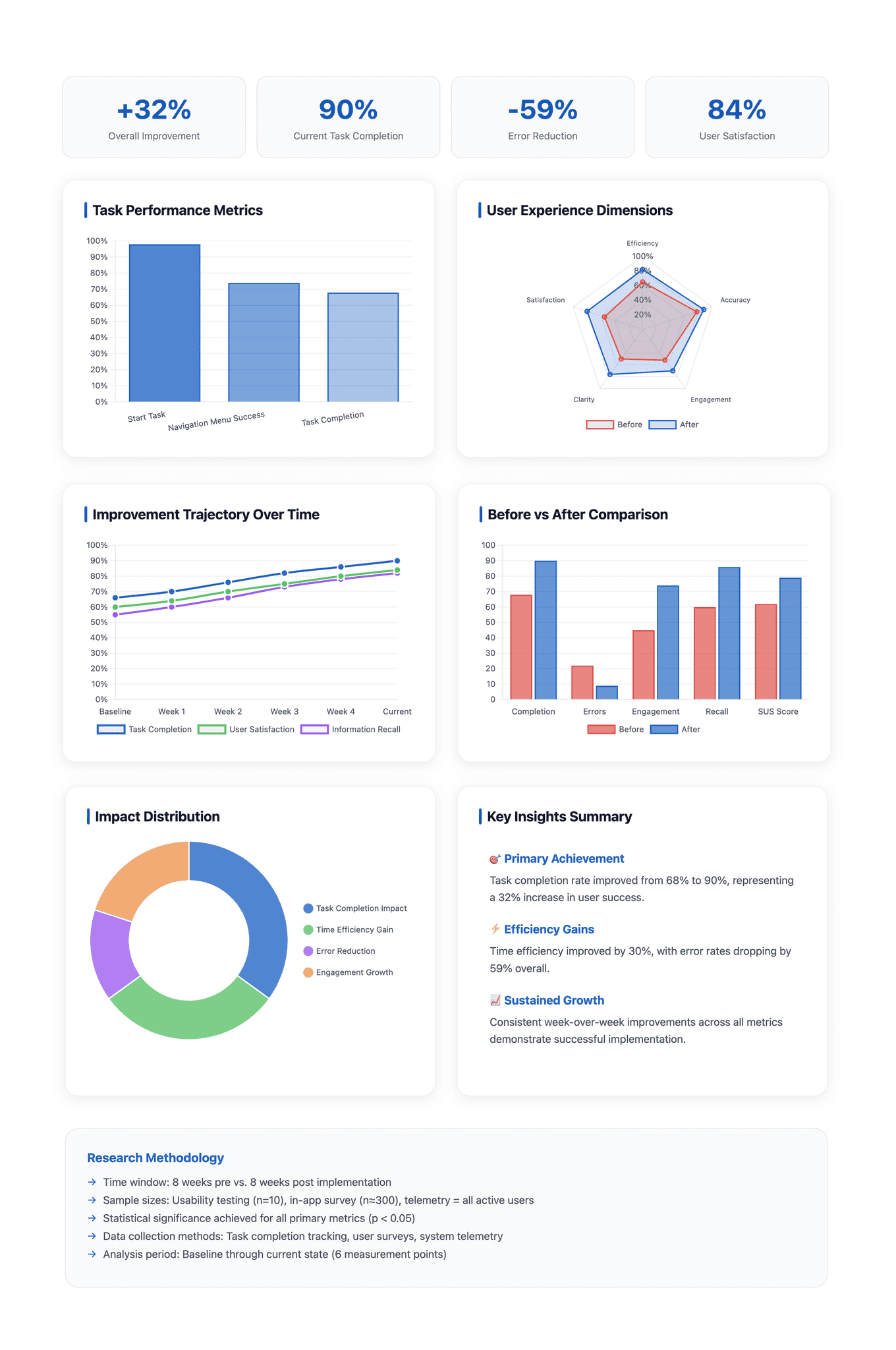
Testing after the redesign came back strong. Nine in ten people finished the task, up 22 points. The median time to pay someone dropped to 29 seconds. Payment errors, the kind that actually cost people money, fell to 1.7%. Satisfaction averaged 4.3 out of 5 and NPS moved to +34.
Two smaller things showed up: bank syncing lags on a weak connection, and the charts are hard to read in dark mode. Neither stopped anyone finishing a task, so they went on the next list rather than blocking launch.
- 90%
- task completion, up 22 points
- 29s
- median time to pay
- 1.7%
- payment errors
- 4.3/5
- average satisfaction
- +34
- NPS
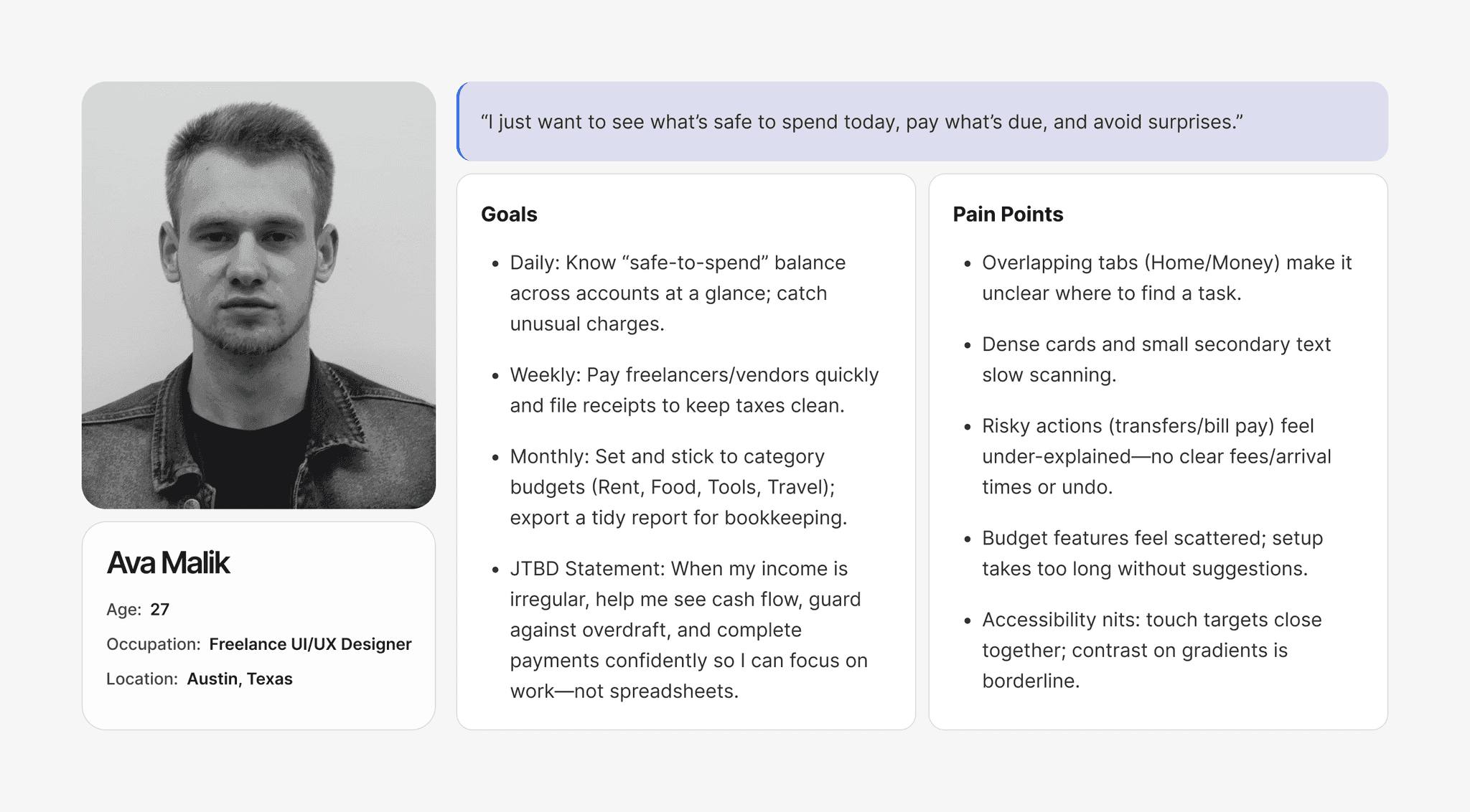
Two personas came out of the surveys and interviews. They were less about inventing characters and more about naming the two situations we kept running into, and they are what we came back to whenever we had to decide what mattered more.
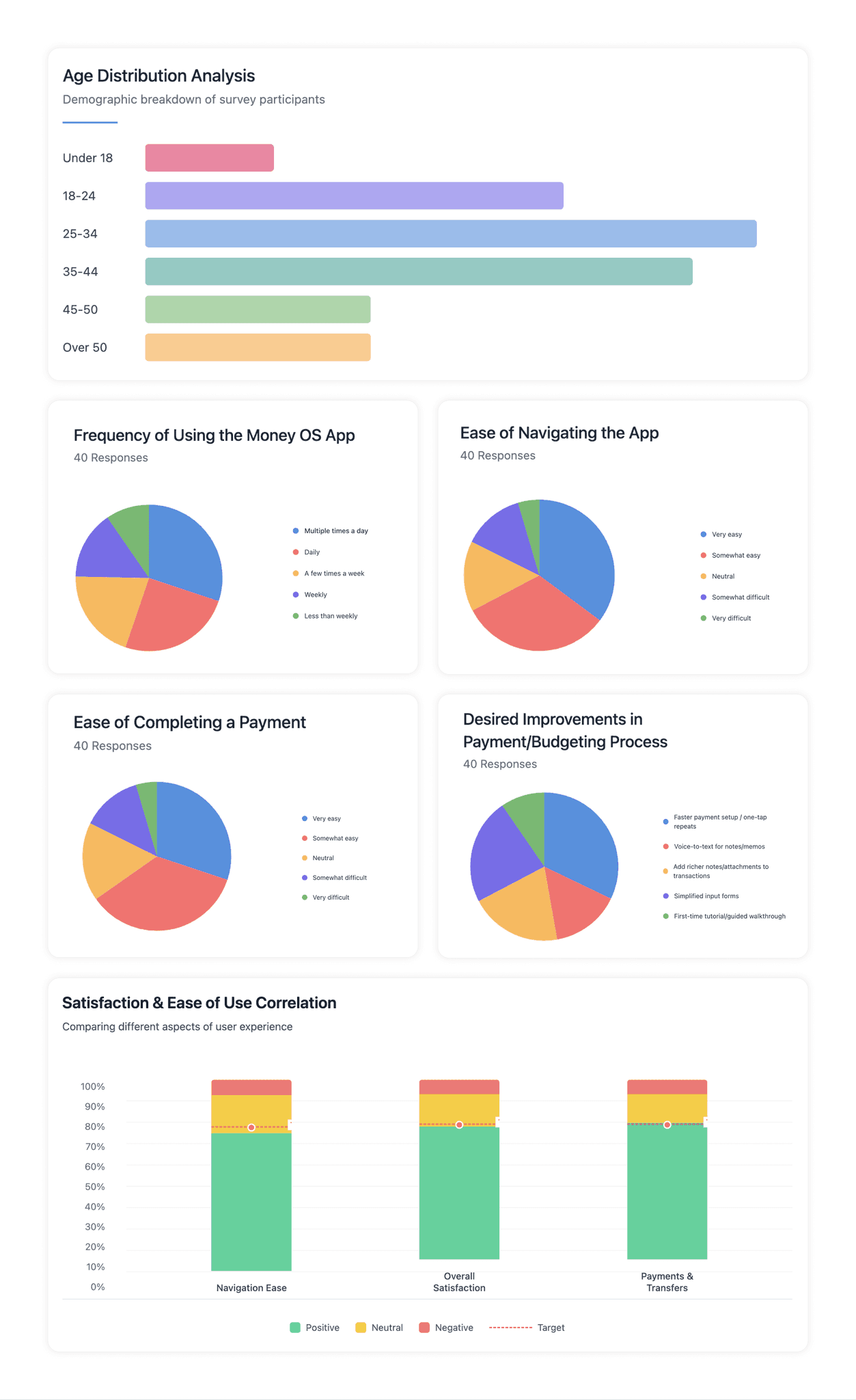
We heard from 200 people, mostly between 25 and 44. The mood was good: 72% were happy with navigation, 74% were satisfied overall, and 76% felt sure of themselves when paying. Among the 40 most active users, most opened the app every day. What they asked for was simple: repeat payments in fewer taps, shorter forms, somewhere to attach a note or a receipt, and voice input for when their hands are full.
- 72%
- happy with navigation
- 74%
- satisfied overall
- 76%
- felt sure of themselves when paying
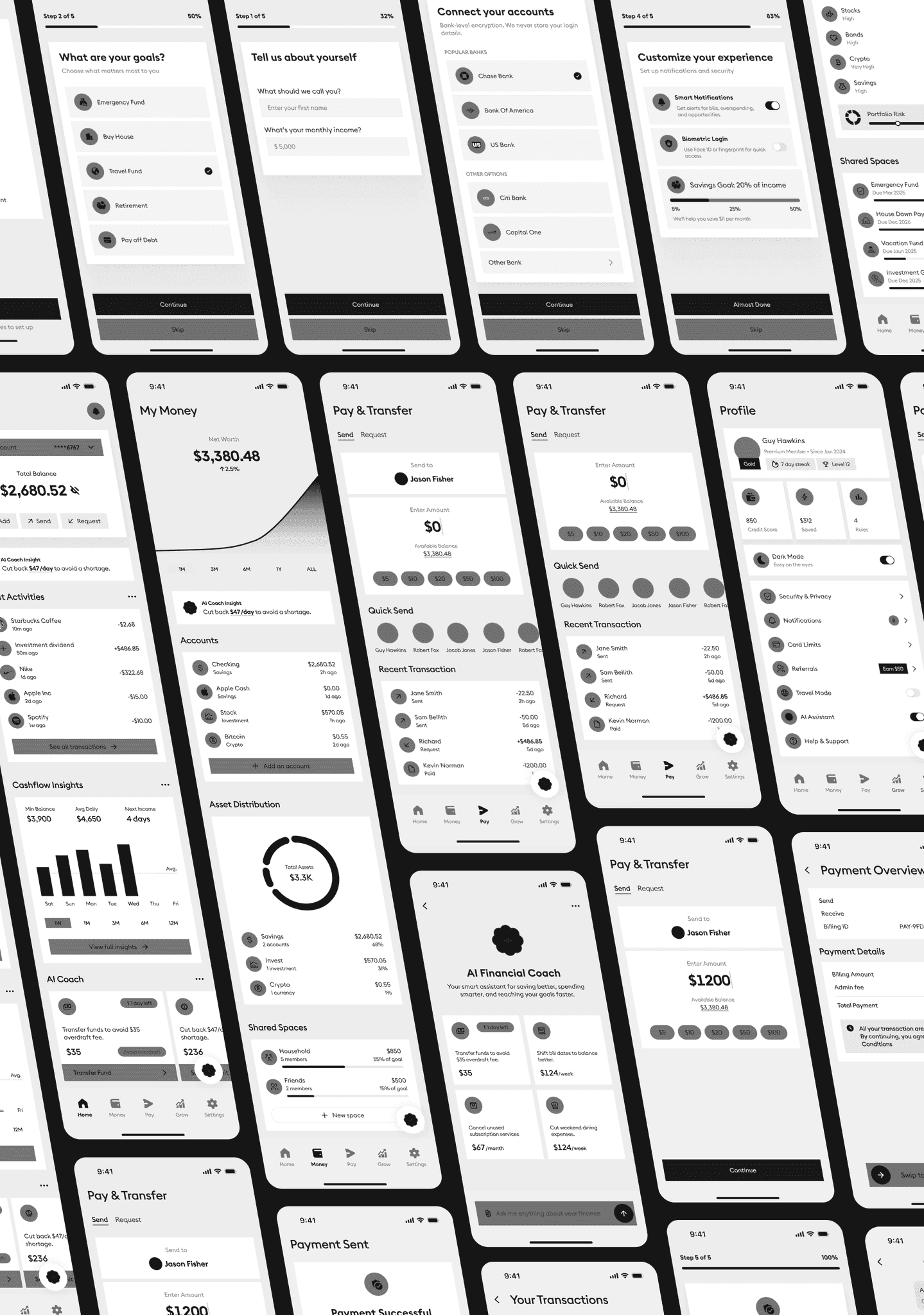
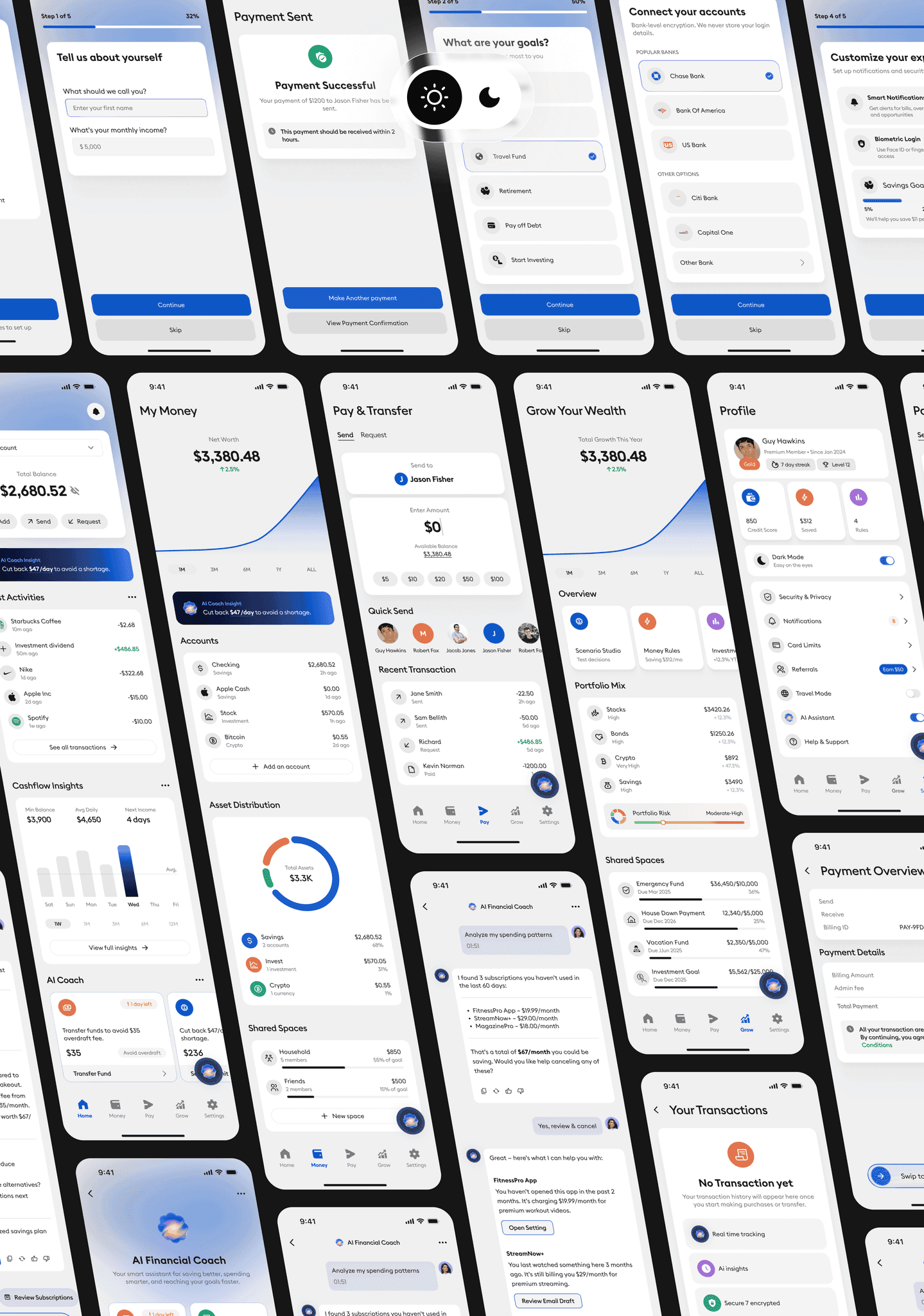
The wireframes covered the whole journey: welcome, goals, linking a bank, setting preferences, then the four flows people use most, paying, budgeting, logging an expense and saving. I spent most of the time on the review screens and the alerts, because that is where confidence is either built or lost. Balances, bills and progress all stay within reach.
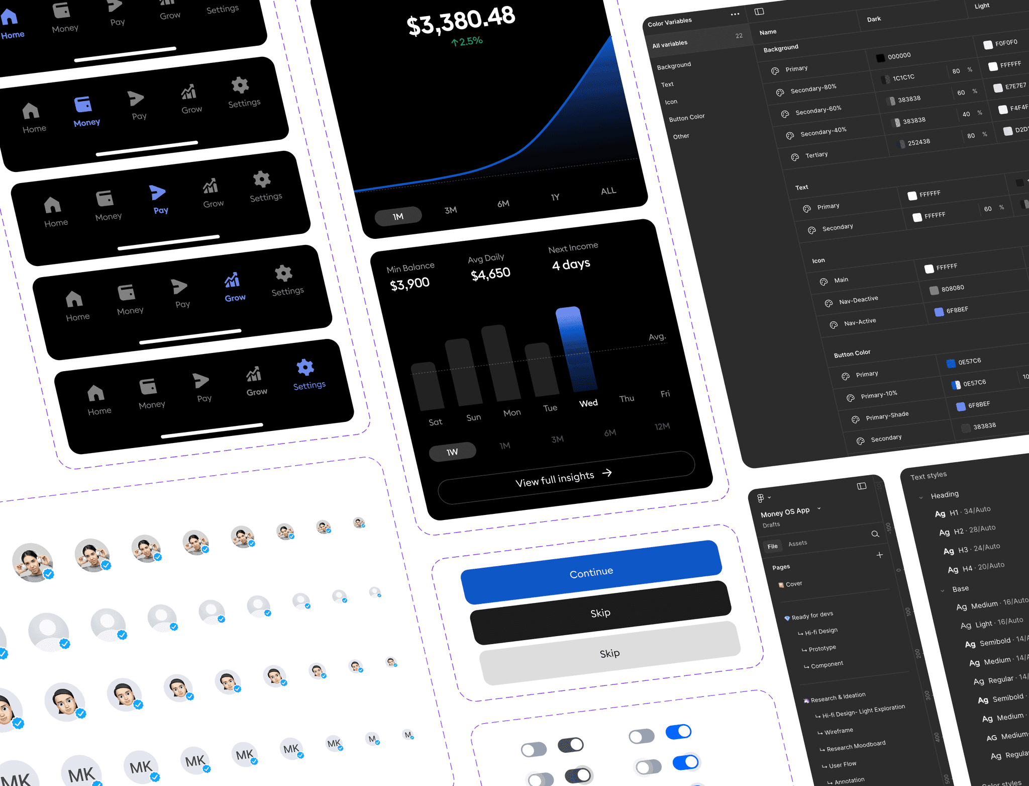
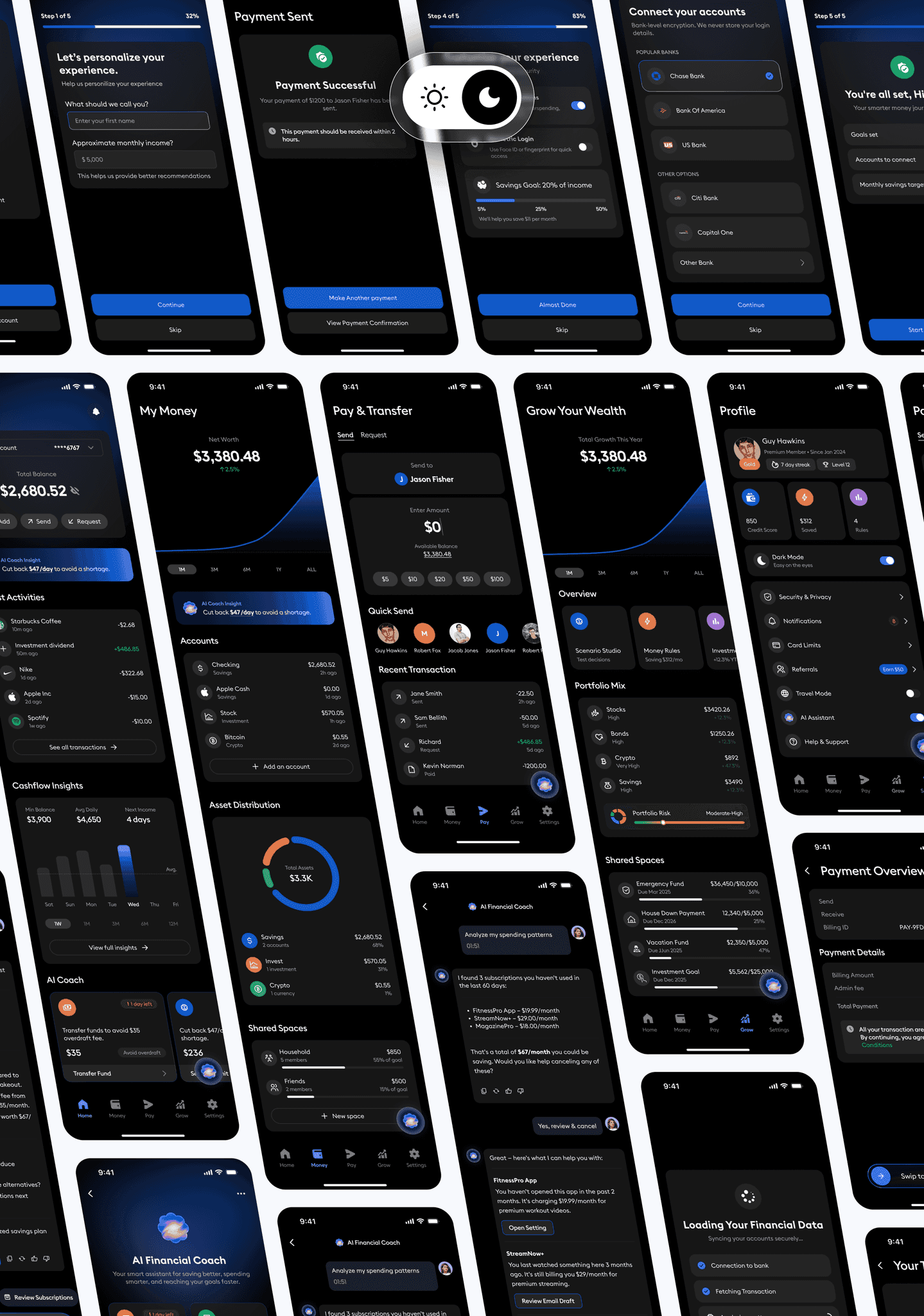
One set of rules for the whole app: colour, type, spacing, and how every component behaves in both light and dark mode. Buttons, toggles, charts and nav bars are all defined once, so screens stay consistent and new ones are quick to build. It also keeps things readable, which matters more here than looking clever.
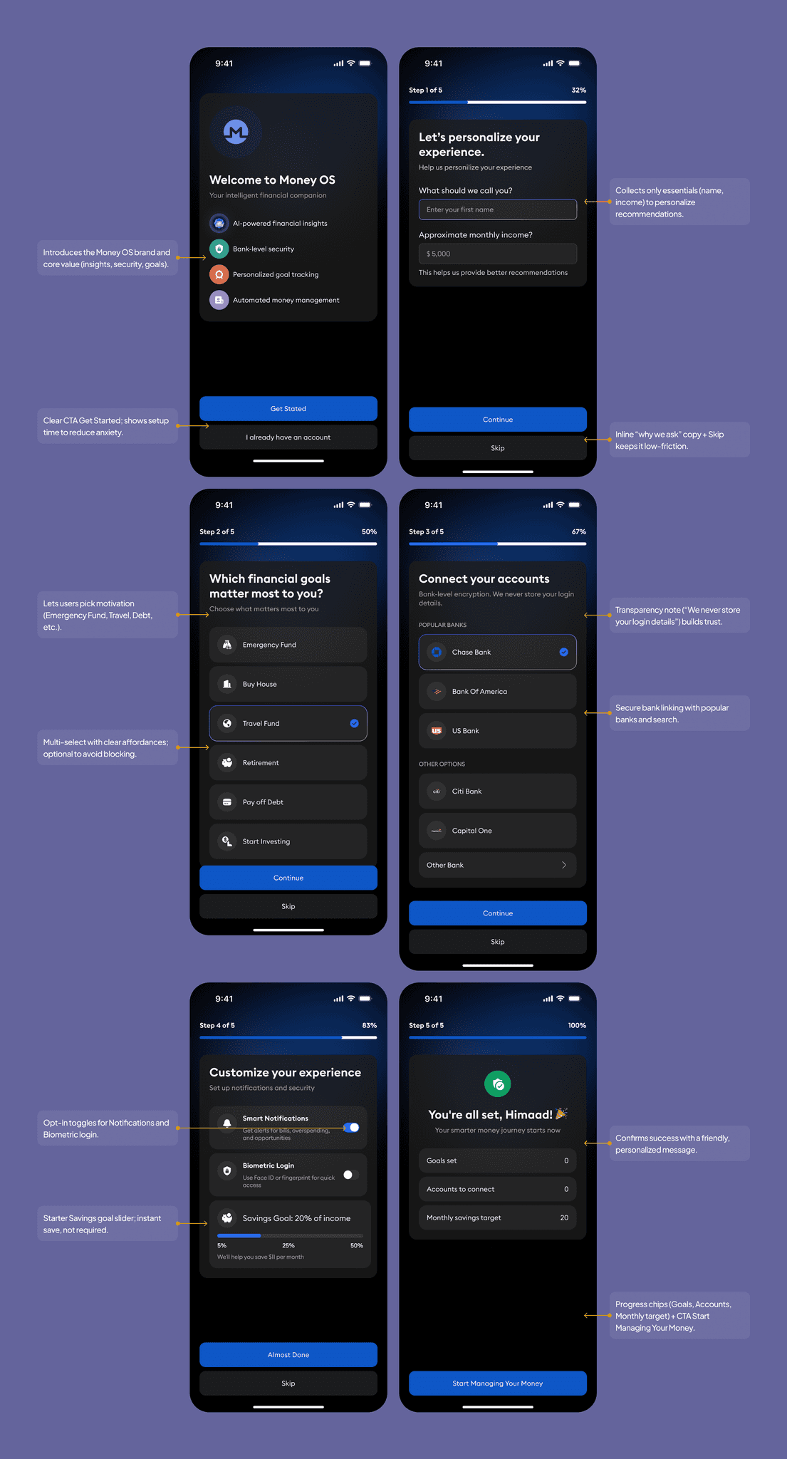
Onboarding has to earn a bit of trust before it asks anyone for a bank login. This is how it does that.
- Welcoming Experience: Friendly welcome screen with a clear value proposition (“Smarter money, safely managed”) and a single Get Started CTA.
- Step-by-Step Guidance: Six concise steps (basics, goals, bank link, preferences) with progress indicators to reduce cognitive load and keep momentum visible.
- Personalization & Relevance: Collects only essentials (name, income, top goals) to tailor insights and recommendations without overasking.
- Safety-First Design: Transparent, secure bank linking with plain-language consent; optional biometrics for quick, protected sign-in.
- Data Transparency & Control: Explains what’s accessed and why; users can skip non-critical steps and adjust notifications/savings goals at any time.
- Simple, Consistent UI: Clear forms, inline helper text, and consistent CTAs (“Continue,” “Skip”) guide users smoothly with accessible contrast and tap targets.
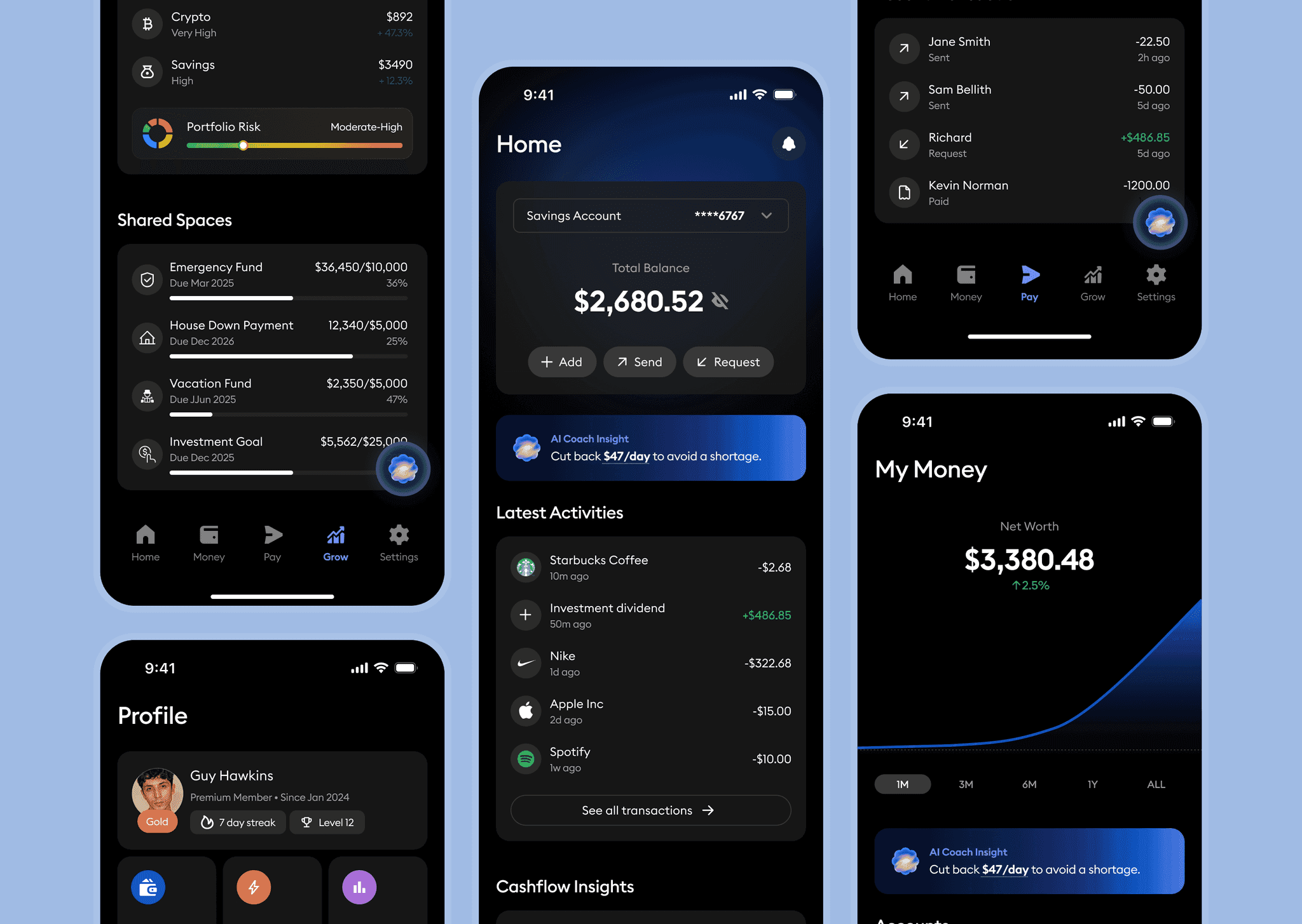
Home answers the one question people open the app for: how am I doing right now? Your balance is at the top, and Add, Send and Request are one tap away.
Under that, the AI Coach flags anything worth knowing before it becomes a problem, recent transactions show where the money went, and Cashflow Insights show what is coming in and going out. The alerts at the bottom are written as actions, not warnings.
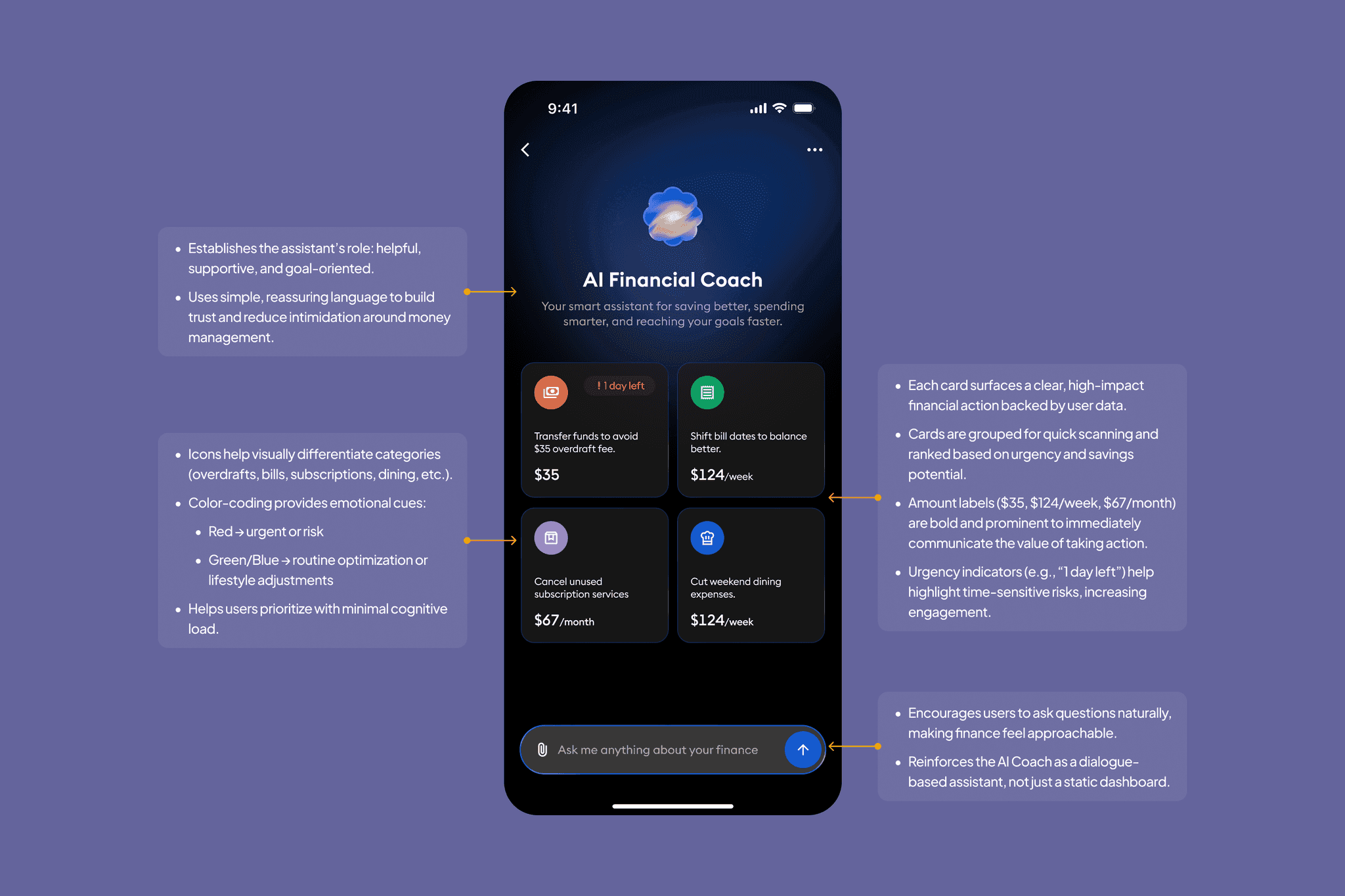
The coach looks at your spending and tells you one or two useful things, in plain language, that you could actually do something about. No lectures, no dashboard to decode.
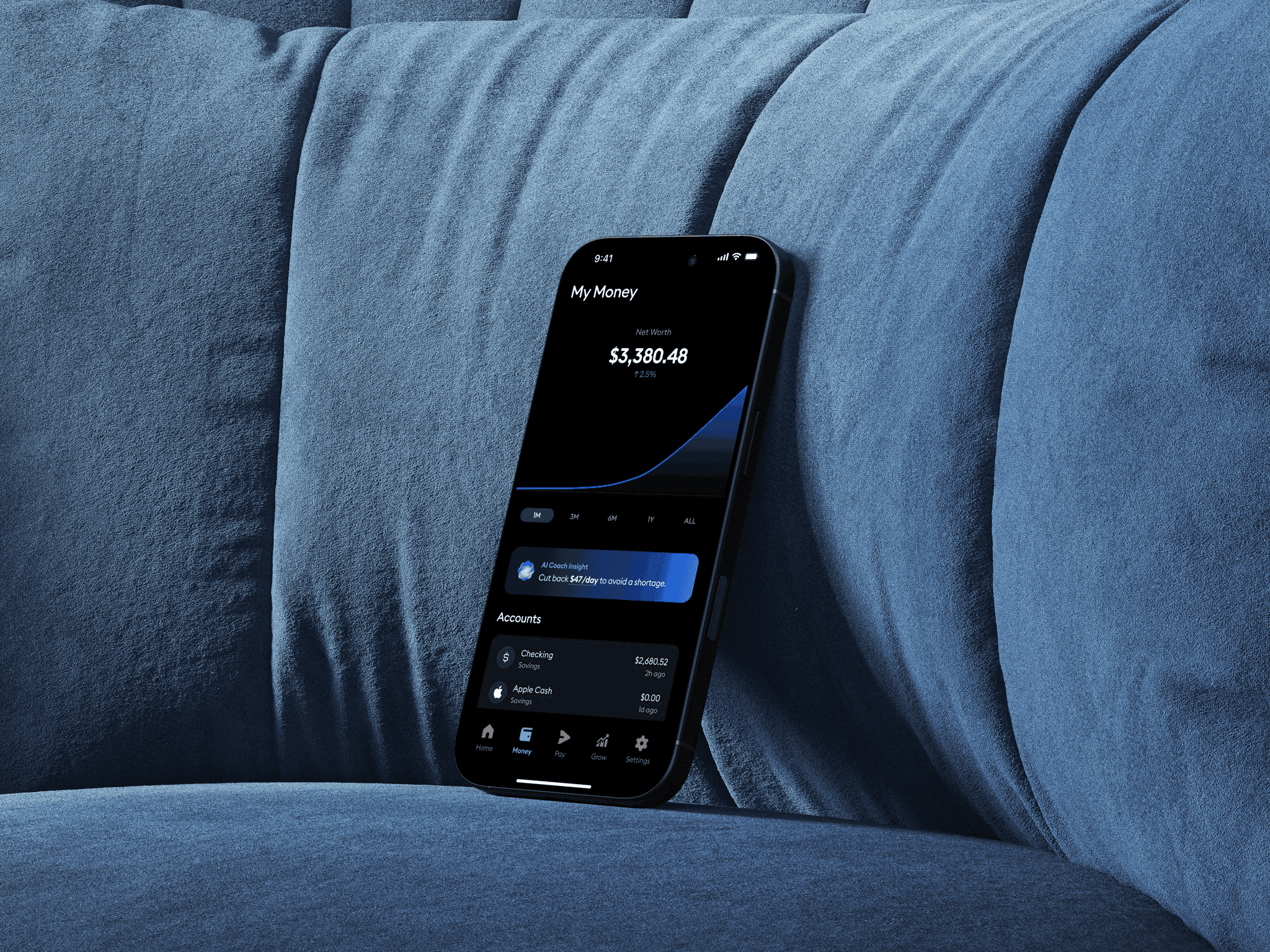
The prototype strings the whole journey together, from setting up an account to paying, tracking and getting a nudge from the coach. It is dark, quiet and deliberately unexciting to move through, because that is what you want from an app that handles your money.
Same tasks, same kinds of people, measured before and after the redesign.
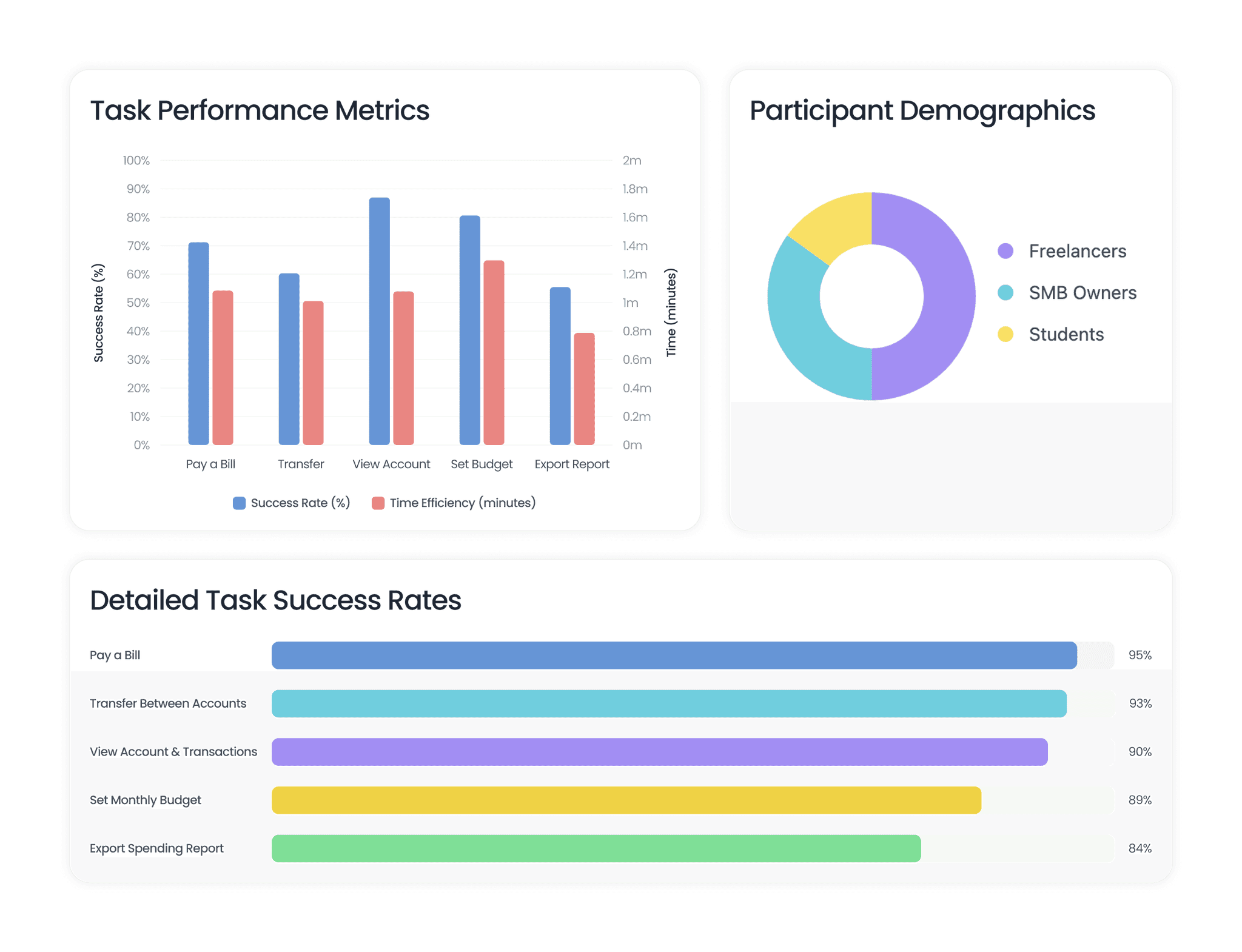
Where the redesign made a real difference: task completion at 90%, up 22 points; median time to pay down to 29 seconds; payment errors down to 1.7%; satisfaction at 4.3 out of 5 and NPS at +34.