Digital health care service web app
Nurses were taking the paperwork home.
Nurses juggled disconnected tools, unreliable sync, and documentation that followed them home.
- UX Designer & Researcher
- 9 months
- Healthcare B2B
- 45% less documentation time per visit
- FigmaMazeMiro
A home-care provider sends nurses into thousands of homes every day. The software they carried with them was quietly making that harder. The numbers told the story before anyone did: 42% of visit notes were being written after hours, and support tickets kept arriving about failed syncs on rural routes. Checking a care plan, updating vitals, confirming a medication, small things, meant jumping between three or four tools or driving back to the office to find a connection. Nurses told us they lost up to 90 minutes a day to this. Ninety minutes of fighting software instead of caring for patients.
This wasn't really an interface problem. It was years of workflow decisions stacked on top of each other, inside a product that assumed everyone had wifi. Each phase below was about pulling those apart and building something that holds up in a parked car in the rain.
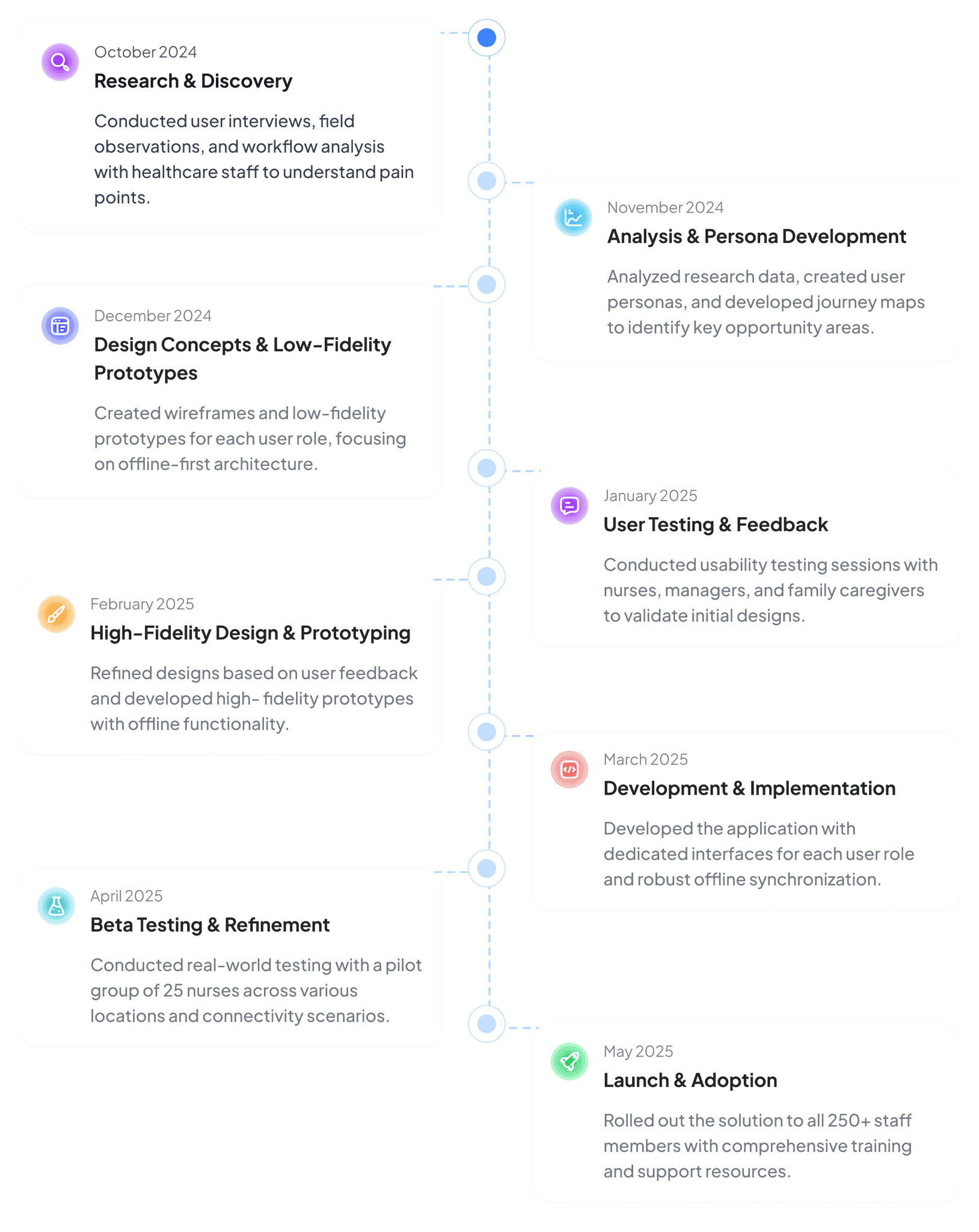
- October 2024, Research & Discovery: Conducted user interviews, field observations, and workflow analysis with healthcare staff to understand pain points.
- November 2024, Analysis & Persona Development: Analyzed research data, created user personas, and developed journey maps to identify key opportunity areas.
- December 2024, Design Concepts & Low-Fidelity Prototypes: Created wireframes and low-fidelity prototypes for each user role, focusing on offline-first architecture.
- January 2025, User Testing & Feedback: Conducted usability testing sessions with nurses, managers, and family caregivers to validate initial designs.
- February 2025, High-Fidelity Design & Prototyping: Refined designs based on user feedback and developed high-fidelity prototypes with offline functionality.
- March 2025, Development & Implementation: Developed the application with dedicated interfaces for each user role and robust offline synchronization.
- April 2025, Beta Testing & Refinement: Conducted real-world testing with a pilot group of 25 nurses across various locations and connectivity scenarios.
- May 2025, Launch & Adoption: Rolled out the solution to all 250+ staff members with comprehensive training and support resources.
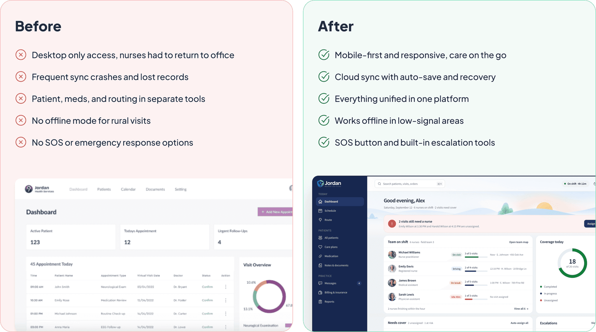
The old platform could handle scheduling and documentation, but it was built for a desk. Sync was unreliable, the tools didn't talk to each other, and offline mode simply didn't exist. The redesign had one non-negotiable: keep working when the connection doesn't.
- Desktop only access, nurses had to return to office
- Frequent sync crashes and lost records
- Patient, meds, and routing in separate tools
- No offline mode for rural visits
- No SOS or emergency response options
- Mobile-first and responsive, care on the go
- Cloud sync with auto-save and recovery
- Everything unified in one platform
- Works offline in low-signal areas
- SOS button and built-in escalation tools
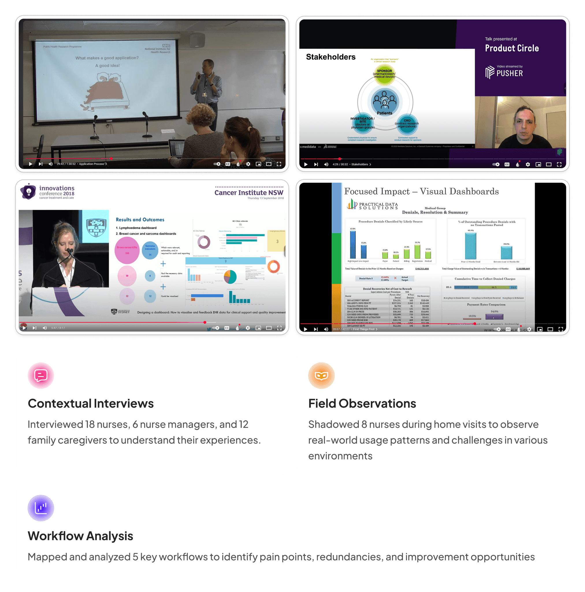
To understand the real workflow, I ran interviews and shadowing sessions with nurses, coordinators and clinical supervisors, plus usability reviews of the existing tool. Sitting in on actual visits is where the useful material came from, the workarounds people had stopped noticing they were doing.
- Contextual Interviews: Interviewed 18 nurses, 6 nurse managers, and 12 family caregivers to understand their experiences.
- Field Observations: Shadowed 8 nurses during home visits to observe real-world usage patterns and challenges in various environments.
- Workflow Analysis: Mapped and analyzed 5 key workflows to identify pain points, redundancies, and improvement opportunities.
- 18
- nurses interviewed, plus 6 nurse managers and 12 family caregivers
- 8
- nurses shadowed during home visits
- 5
- key workflows mapped and analyzed
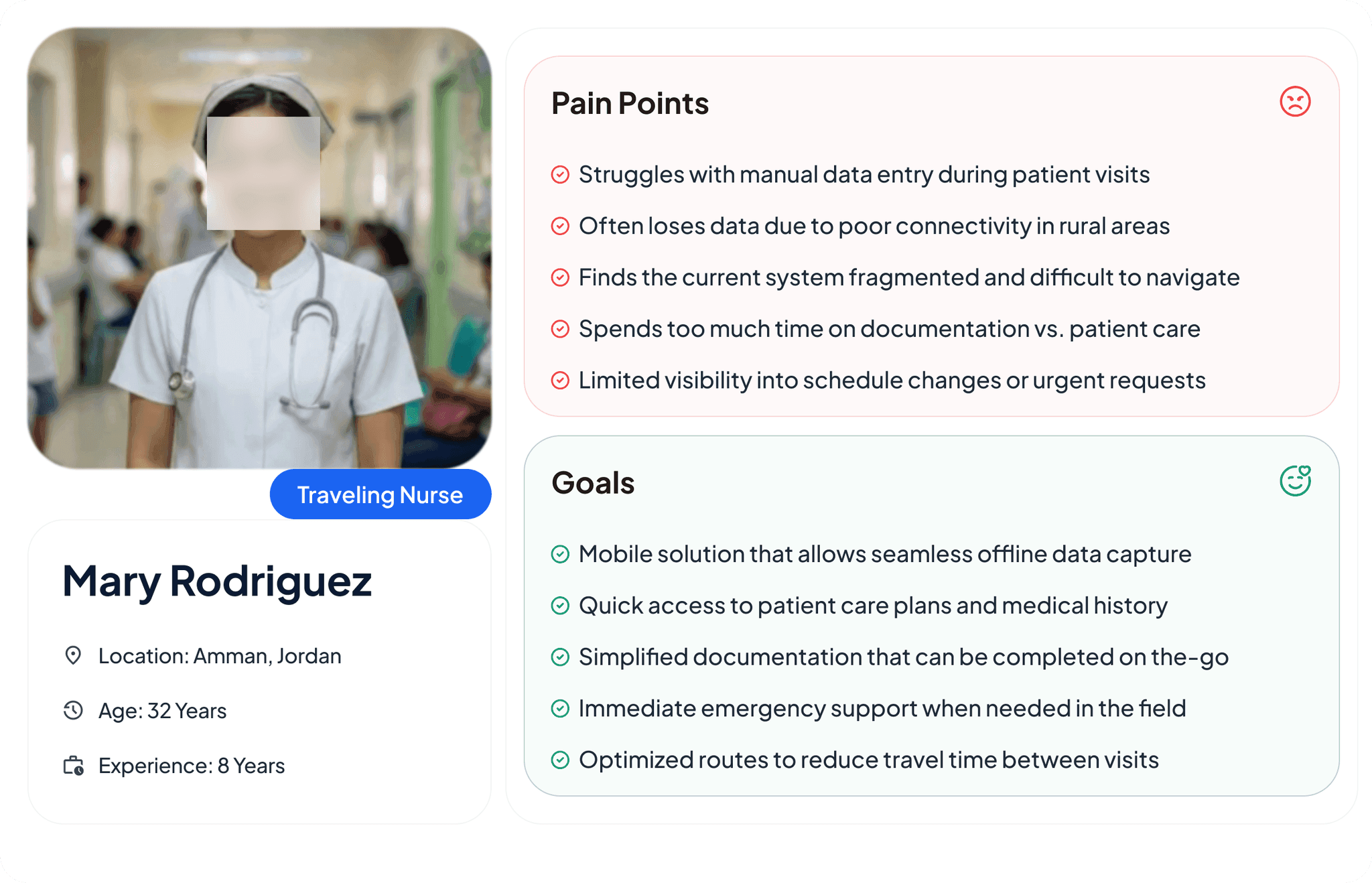
Our primary persona was the home-care nurse: tight schedule, long drives, complicated patients, and a phone that may or may not have bars. Mapping a full day showed where things broke down, finding patient context, catching alerts, writing notes, and being ready when something goes wrong.
- Pain point: Struggles with manual data entry during patient visits
- Pain point: Often loses data due to poor connectivity in rural areas
- Pain point: Finds the current system fragmented and difficult to navigate
- Pain point: Spends too much time on documentation vs. patient care
- Pain point: Limited visibility into schedule changes or urgent requests
- Goal: Mobile solution that allows seamless offline data capture
- Goal: Quick access to patient care plans and medical history
- Goal: Simplified documentation that can be completed on the go
- Goal: Immediate emergency support when needed in the field
- Goal: Optimized routes to reduce travel time between visits
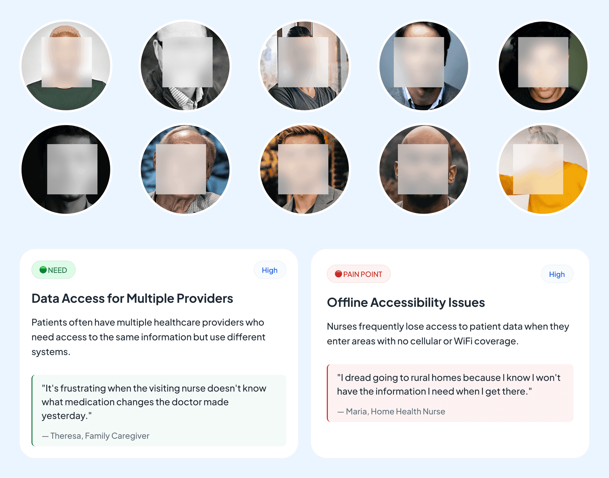
Four things came up over and over. Nurses needed patient context faster. Alerts needed to be obvious, not buried. Documentation had to take seconds, not minutes. And all of it had to work with no connection. Every decision after this traced back to one of those four.
- Need (high priority), Data Access for Multiple Providers: Patients often have multiple healthcare providers who need access to the same information but use different systems.
It's frustrating when the visiting nurse doesn't know what medication changes the doctor made yesterday.” (Theresa, family caregiver)
- Pain point (high priority), Offline Accessibility Issues: Nurses frequently lose access to patient data when they enter areas with no cellular or WiFi coverage.
I dread going to rural homes because I know I won't have the information I need when I get there.” (Maria, home health nurse)
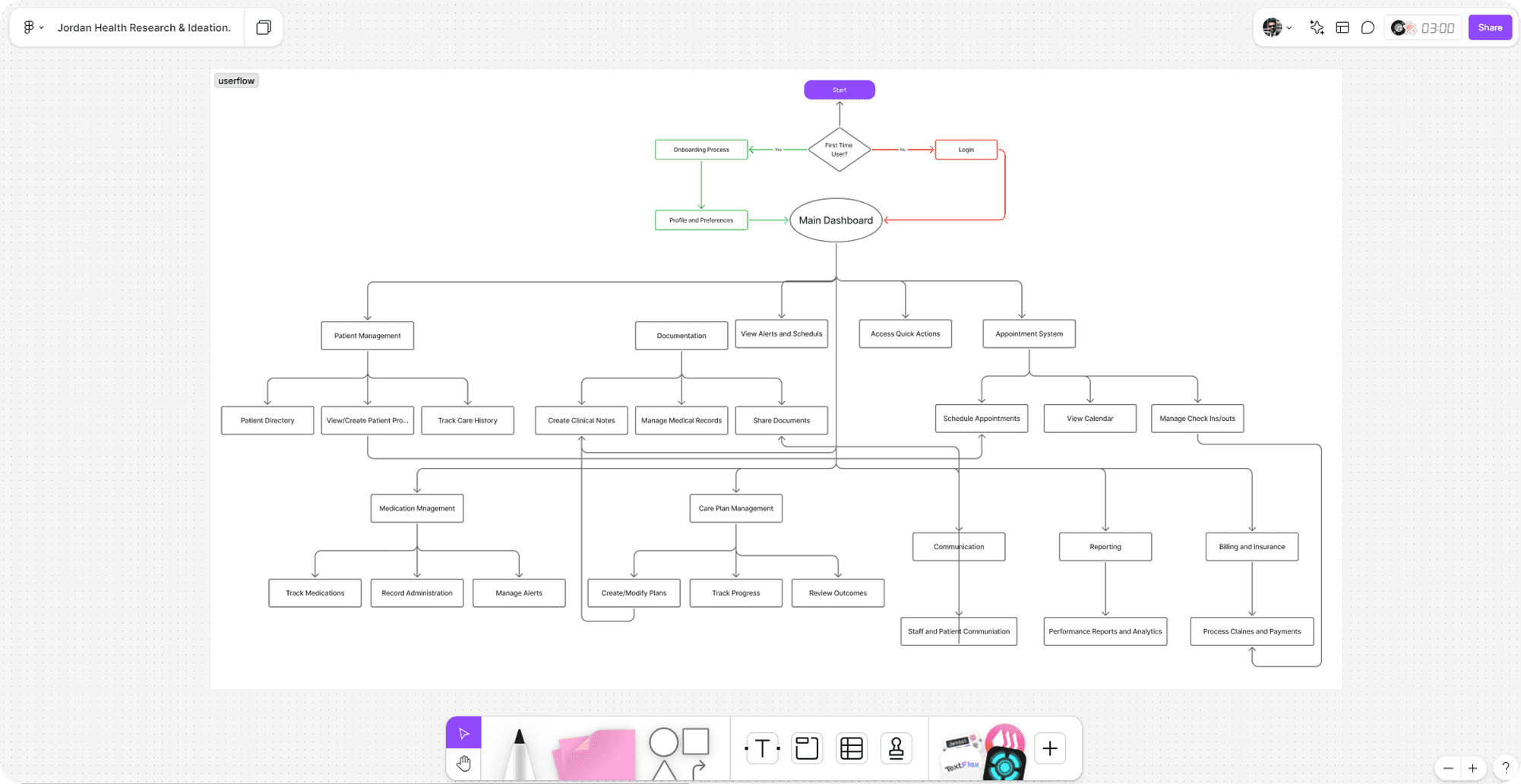
The old product grew one feature at a time over several years, which left tangled navigation and several routes to the same screen. I rebuilt the flow around how nurses actually described their day, visit prep, route, documentation, and cut the branching that made people guess.
I kept these deliberately rough until the field feedback was in. Low fidelity meant we could argue about visit sequencing, alert priority and what offline should actually feel like, without anyone getting attached to a colour. Those sessions turned up edge cases no requirements document had mentioned.
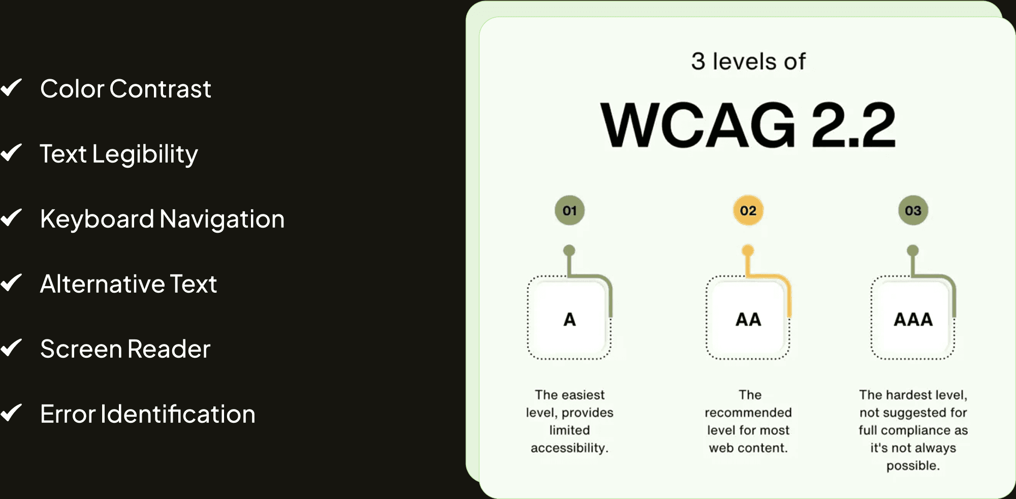
Nurses work outdoors, in cars, and in dimly lit homes. Accessibility here wasn't a compliance box, it was whether someone could read a dose at dusk. We pushed contrast up for sunlight, tightened the text hierarchy, made touch targets bigger for gloved hands, and made keyboard and screen-reader behaviour predictable on the office workstations.
- Color contrast
- Text legibility
- Keyboard navigation
- Alternative text
- Screen reader
- Error identification

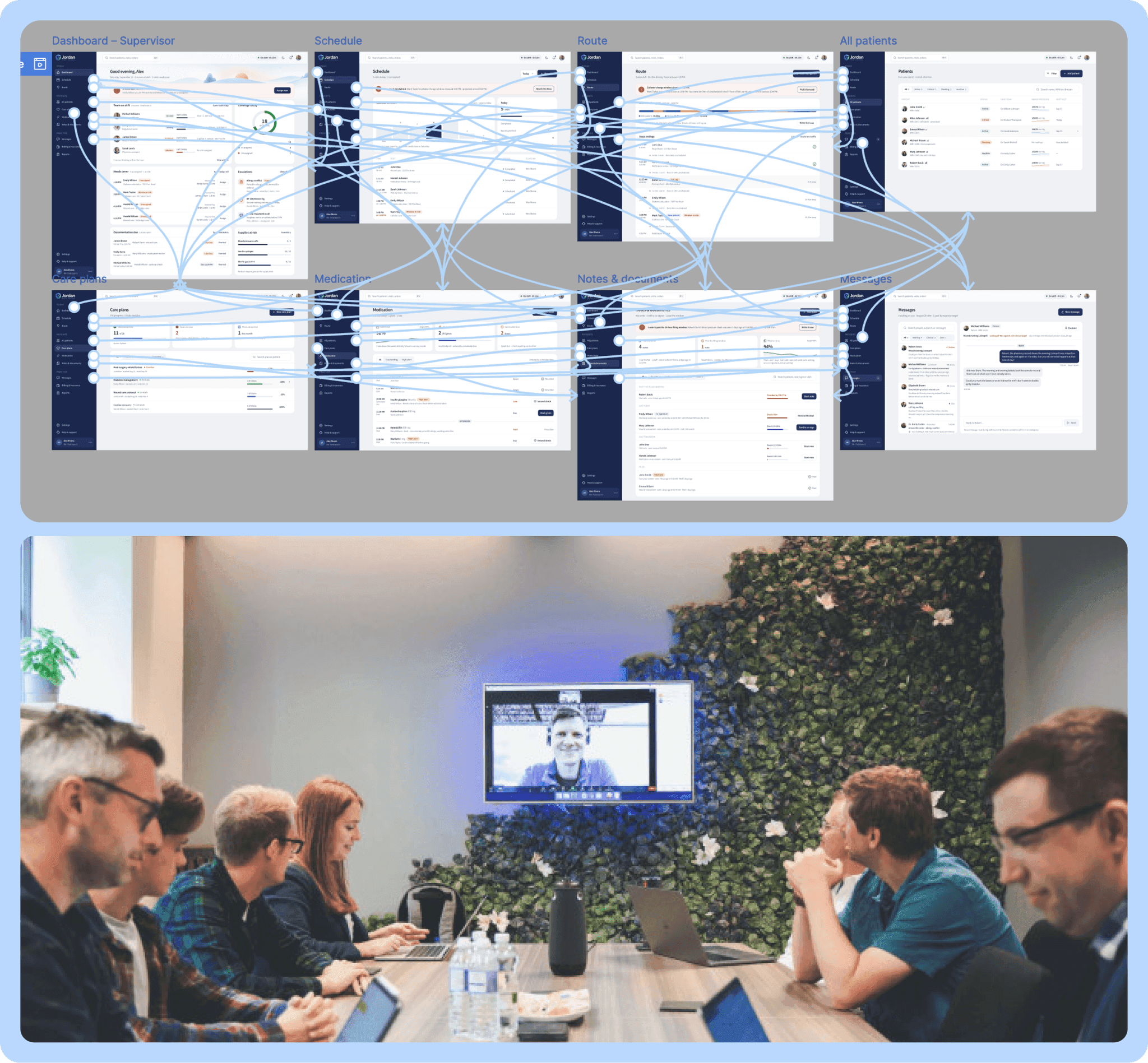
This redesign touched almost every part of the system, so I worked alongside engineering the whole way. Me on interaction models, them stress-testing data constraints, offline behaviour and state logic. Weekly reviews caught dependency problems while they were still cheap to fix.
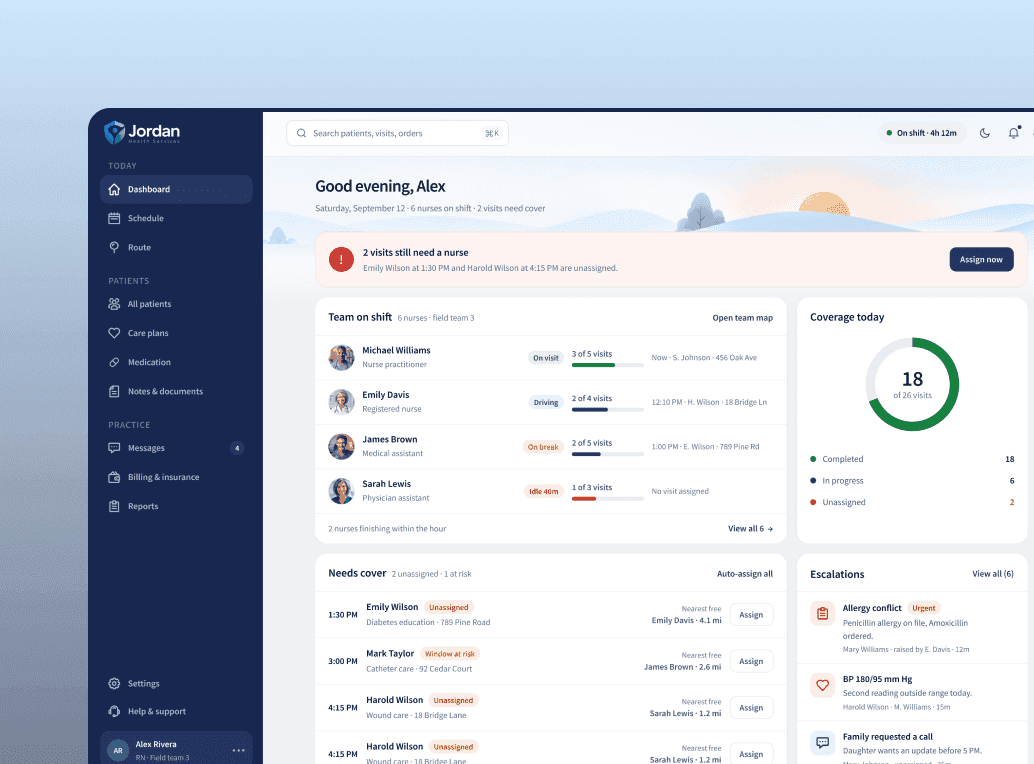
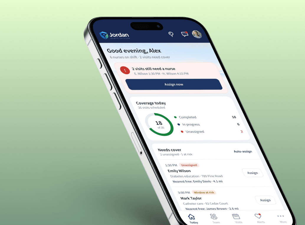
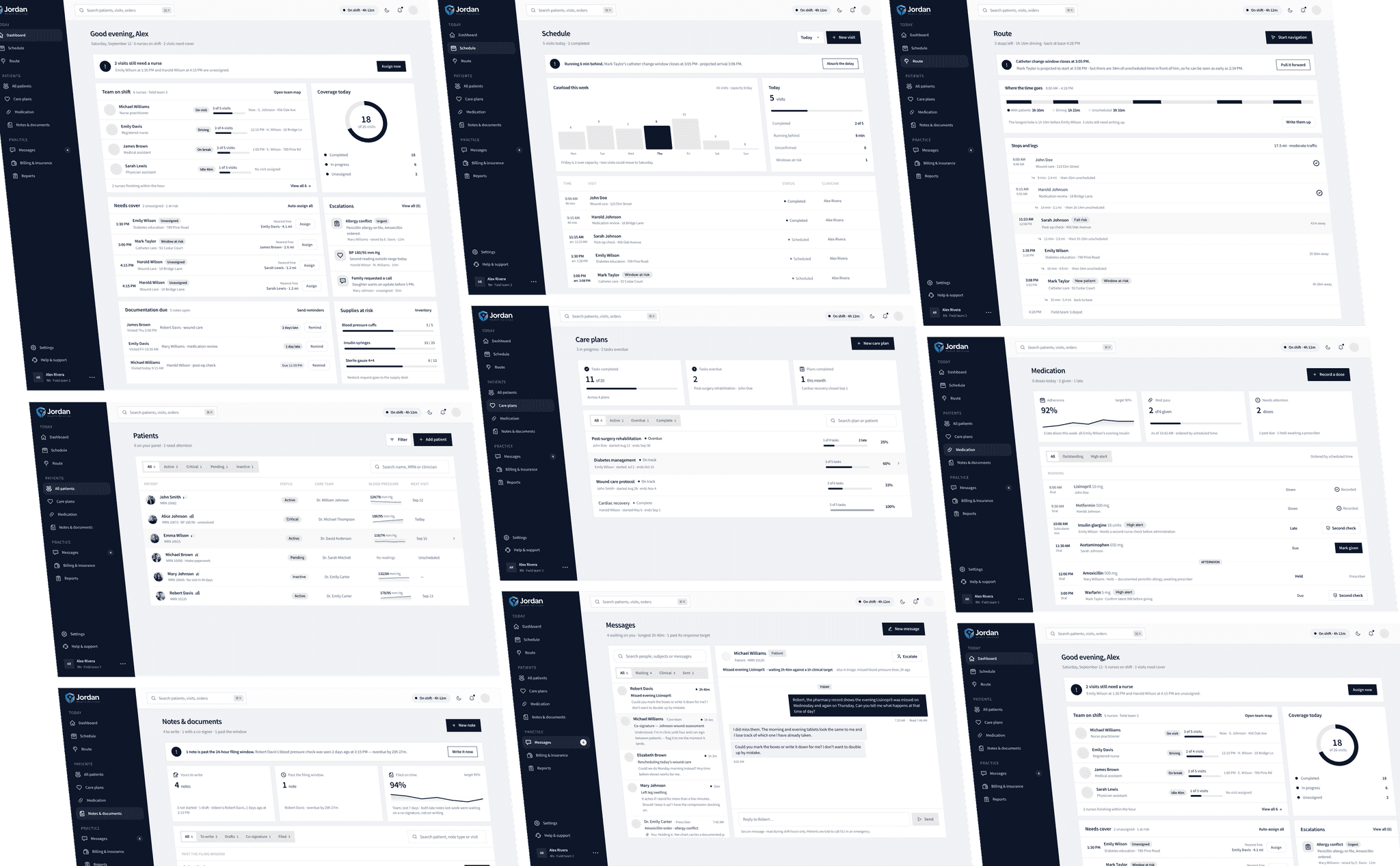
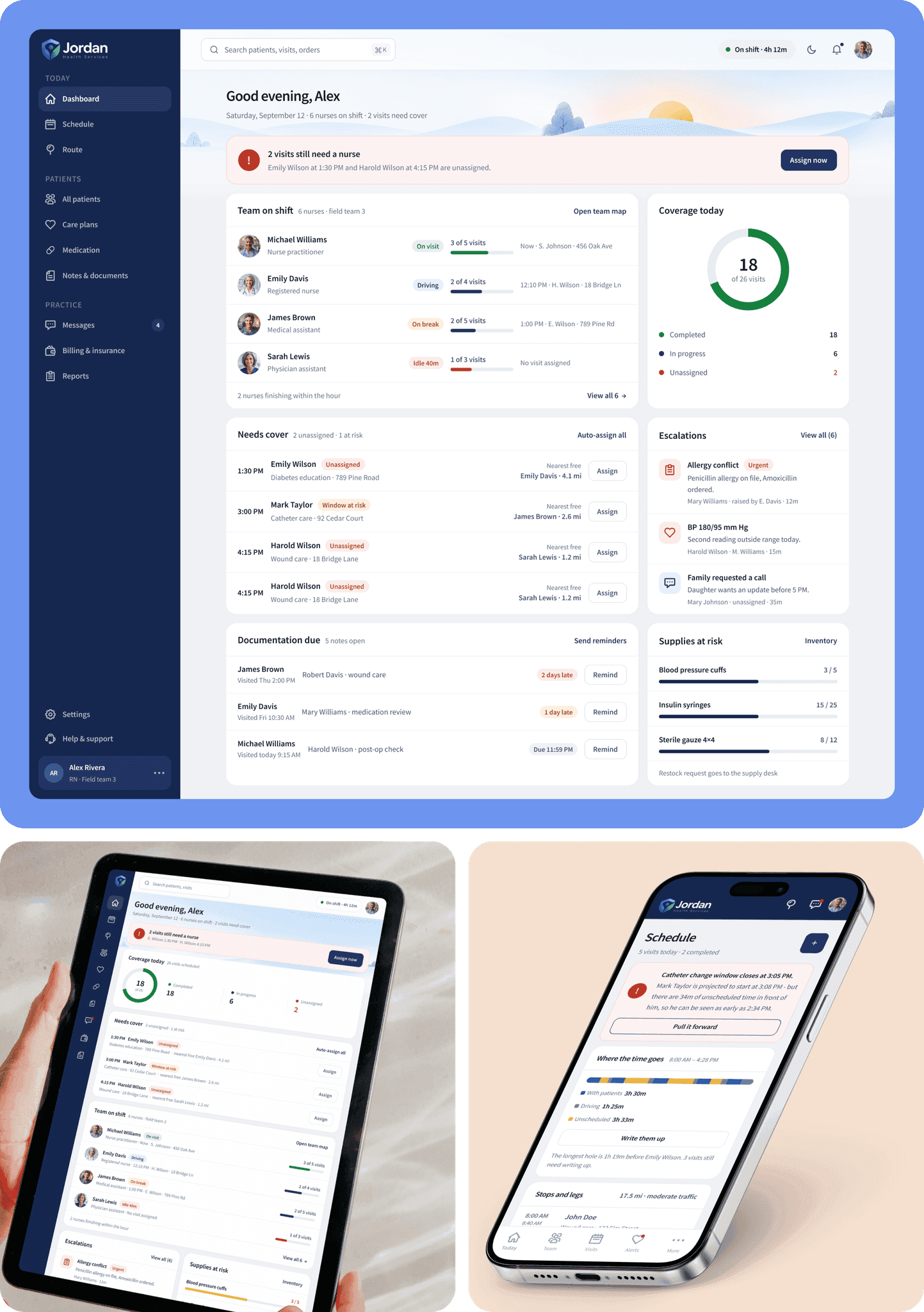
The dashboard is built for one person: a nurse about to start their day. Today's visits, the route, patient alerts and medication tracking, all in one place, all readable at a glance.
It also accounts for the things that actually derail a day, traffic, weather, a medication flag, so it works less like a screen and more like a briefing.
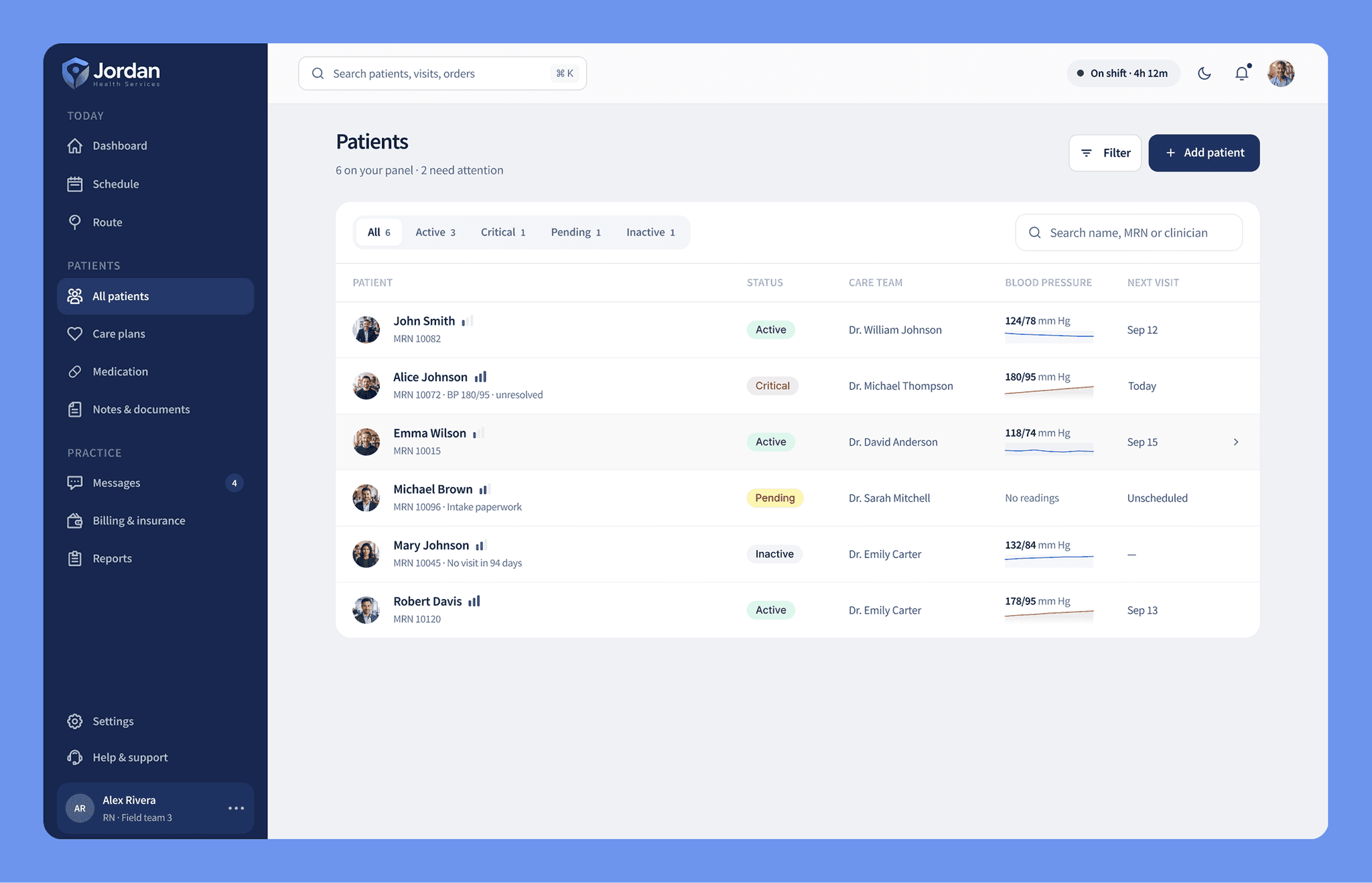
Patient statuses (active, inactive, critical, pending) are now grouped and clearly labelled. Staff can scan, filter and act without digging through one long list.
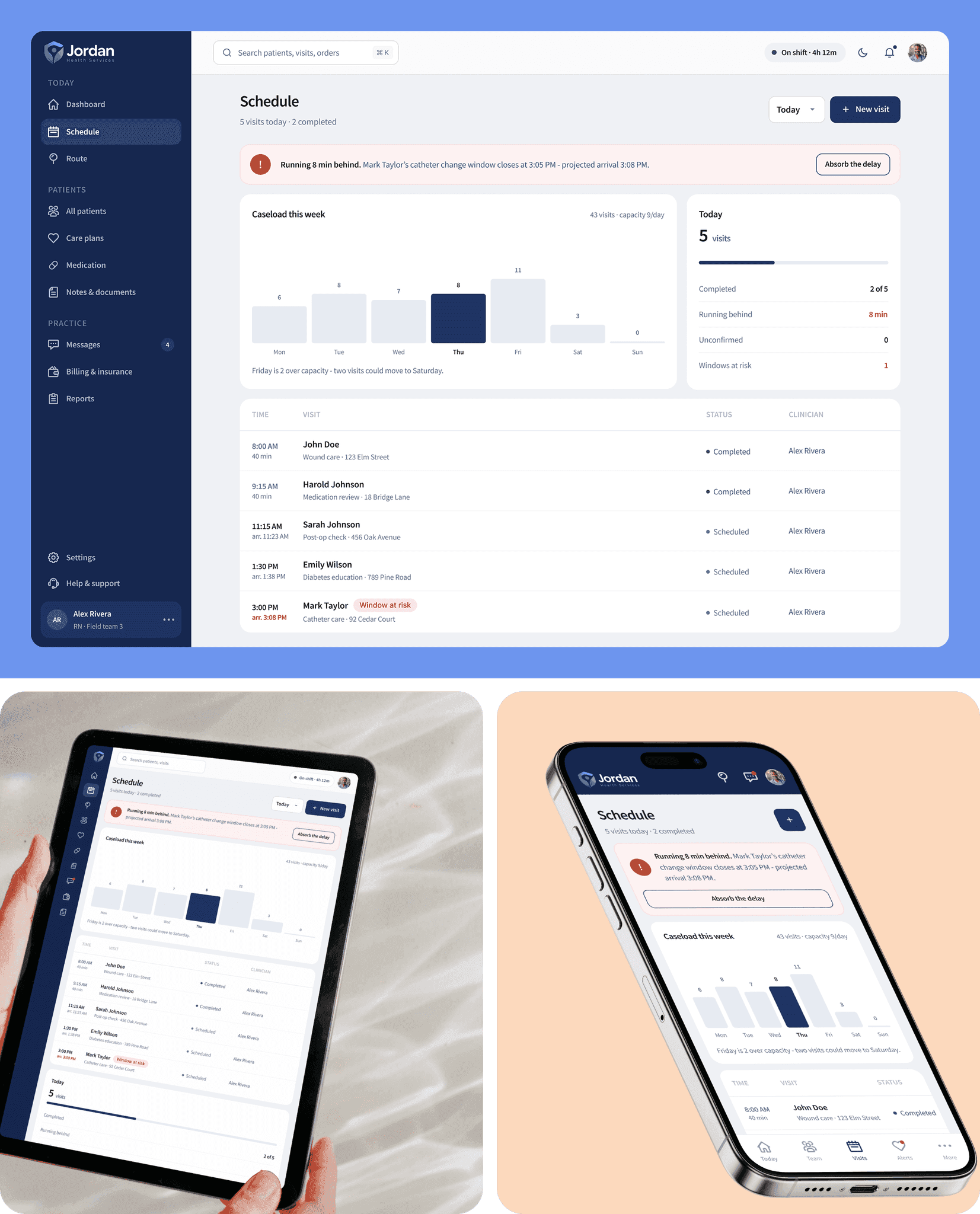
The appointment screen pulls routing, visit context and urgency into one view. A nurse can see the whole day, including travel time and what each visit involves, before leaving the house.
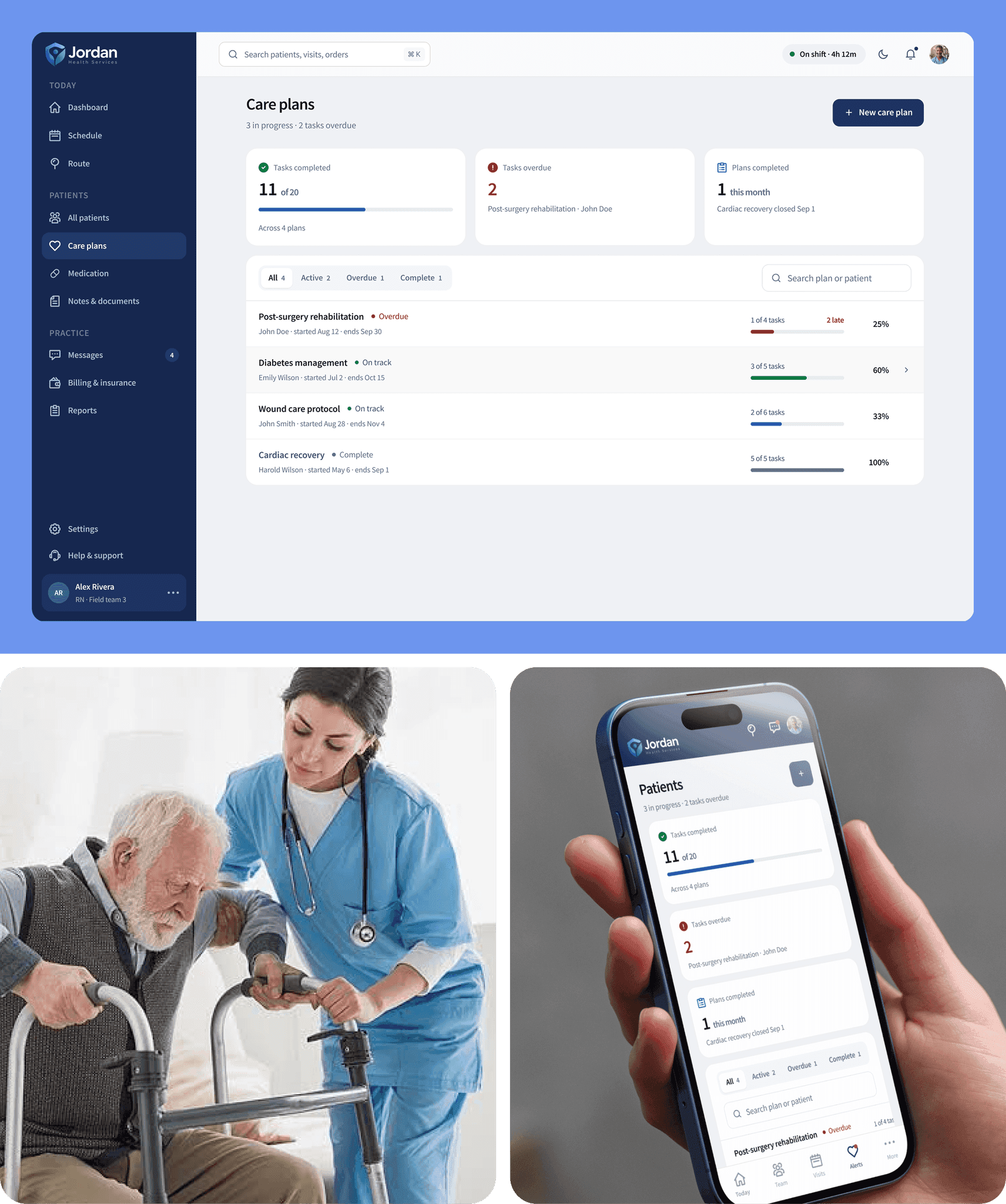
Care plans used to sit in a separate tool, which is why they often went unread. Now they're one tap from the visit, showing the current goals, the treatment timeline, how much is complete and anything the last nurse flagged. You walk in already knowing where things stand.
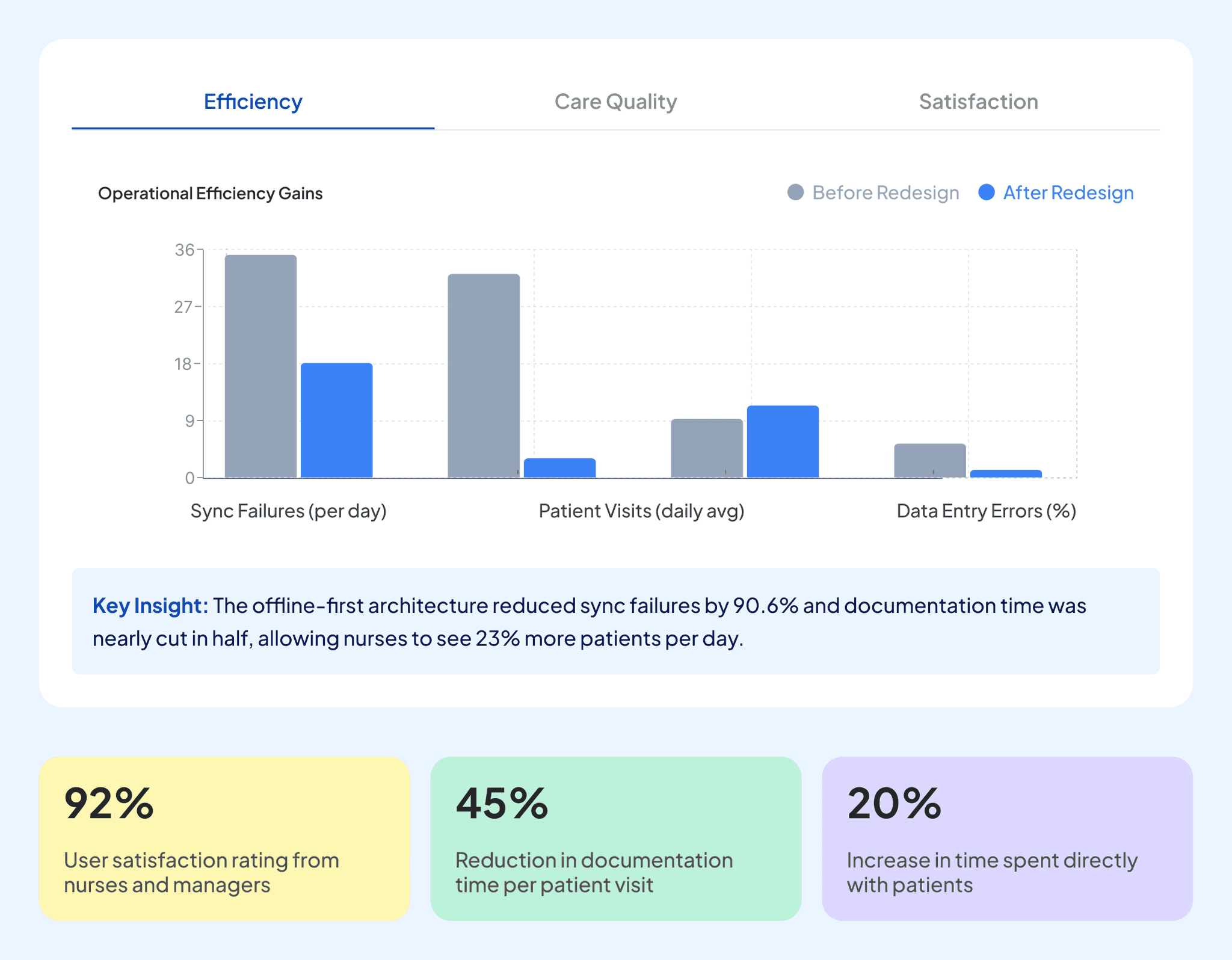
We tested the old and new builds side by side with nurses, measuring task completion, time on task and error rate across the flows that matter most: patient lookup, scheduling, care plans, medication and emergency response. The charts below show where the redesign moved the numbers.
- Participants: 60% registered nurses, 20% nurse practitioners, 20% home healthcare coordinators.
- Tasks measured for success rate and average time: patient registration, schedule home visit, create care plan, medication management, generate reports, and emergency alert.
- Ratings out of 5 covered interface design, navigation, task completion, feature accessibility, mobile experience, and overall satisfaction.
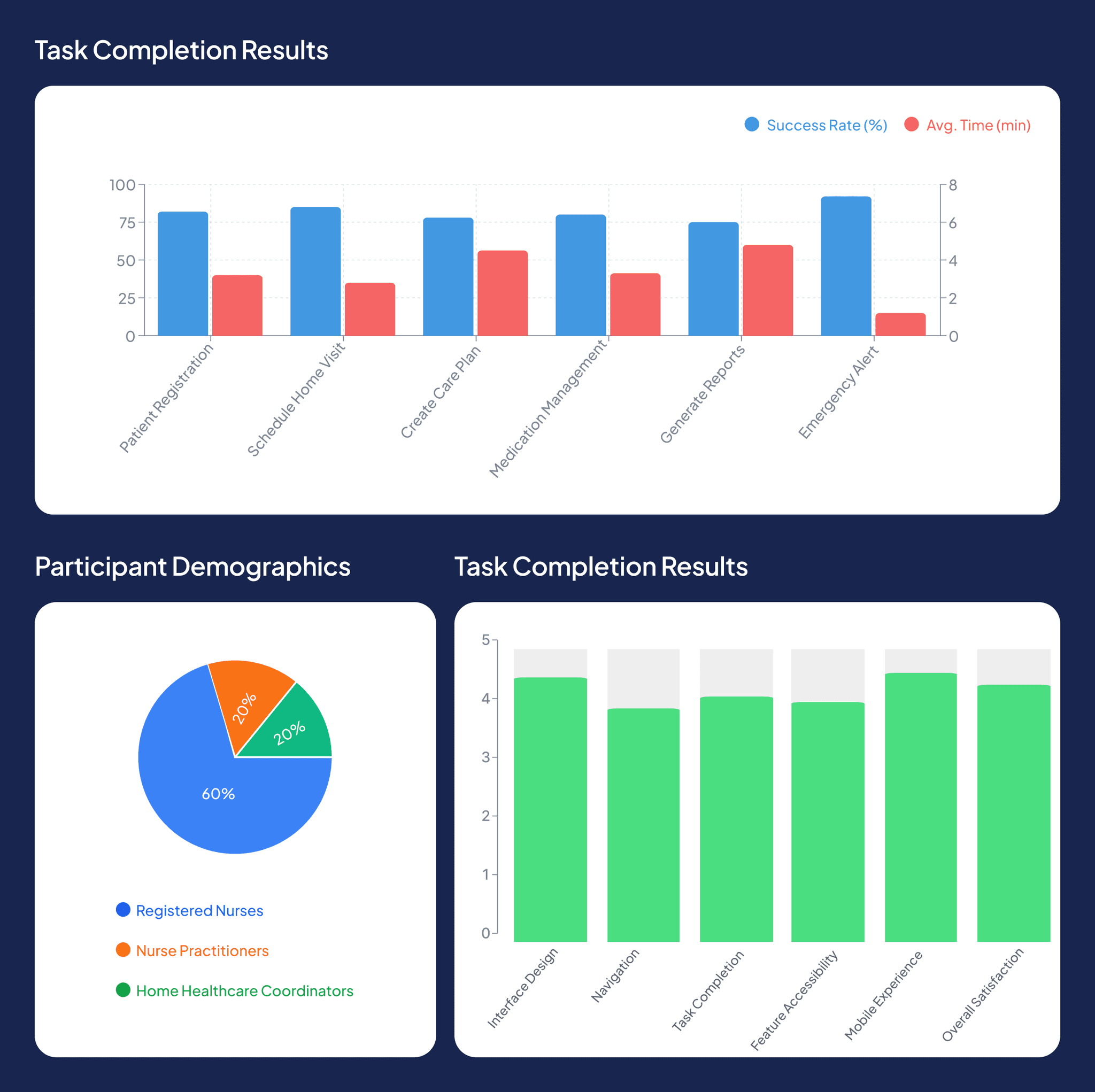
The offline-first architecture did the heavy lifting: sync failures dropped 90.6% and documentation time was nearly halved, which gave nurses 23% more patient visits a day. Satisfaction among nurses and managers landed at 92%, documentation time per visit fell 45%, and time spent directly with patients rose 20%.
- 90.6%
- fewer sync failures
- 23%
- more patient visits a day
- 92%
- satisfaction among nurses and managers
- 45%
- less documentation time per visit
- 20%
- more time spent directly with patients