Analyze market data, track authentication performance
A good find couldn’t wait for an answer.
Resellers had minutes to make a decision. Authentication services could take hours or days.
- Lead Product Designer
- 8 weeks
- iOS & Android mobile app
- 70% increase in weekly active users
- FigmaNotionMazeMiro
The app tells resellers, small shops and collectors whether a luxury item is real, in seconds. Before it existed, the options were shipping the bag to a facility and waiting a day or two, or guessing. Neither of those works when you have five minutes to decide whether to buy something. I designed the mobile experience end to end. Time to a first scan dropped from eight minutes to under 60 seconds, the new features tripled projected daily use, and the free tier finally has an honest reason to upgrade, with a path to 10% or better conversion.
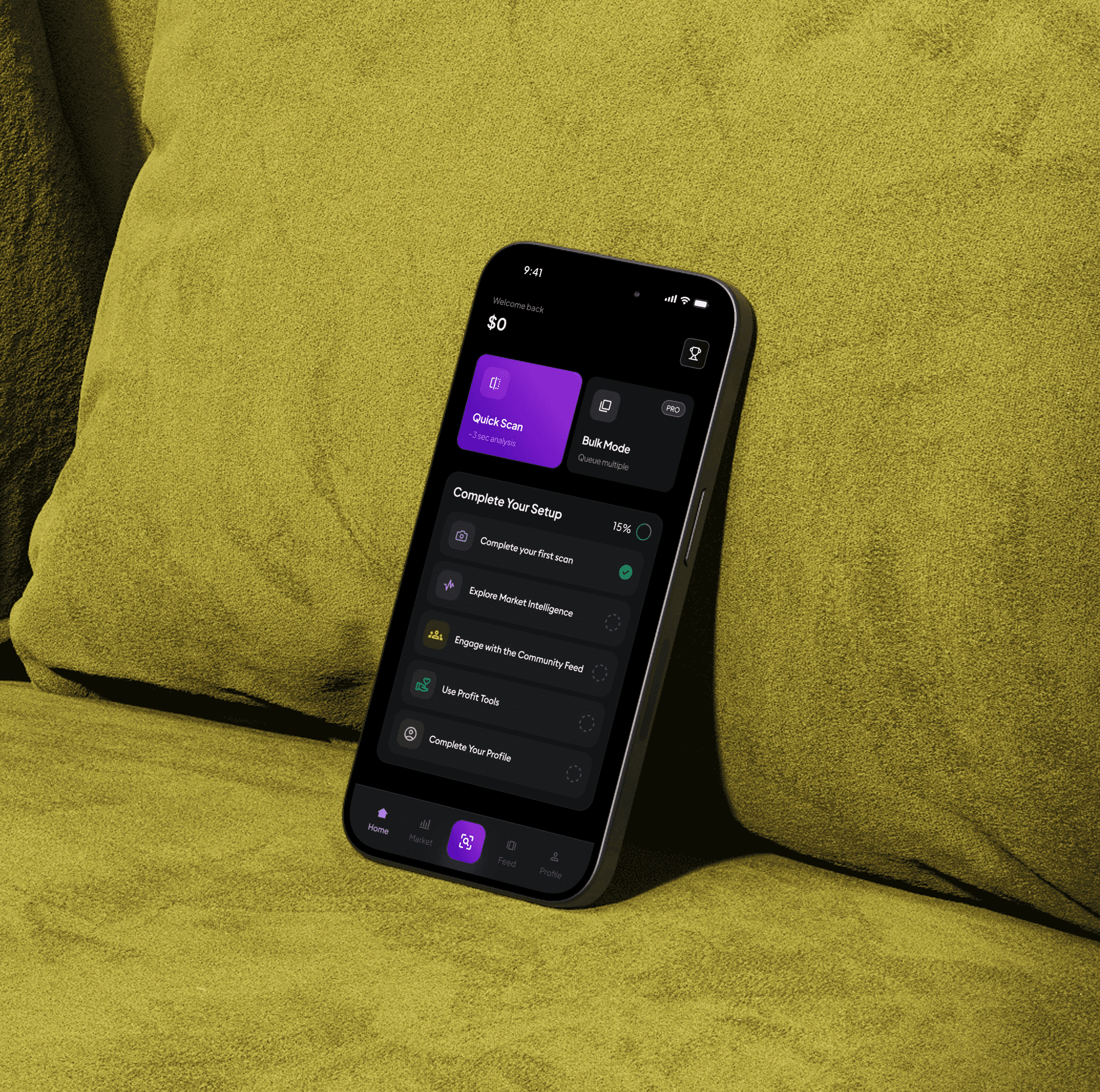
The work behind the app was iterative and grounded in how resellers actually operate. I started with research into how people handle authentication and market data, and where the information overload sets in. That fed wireframes built around simplicity, guided actions and clear hierarchy. Several rounds of prototyping and testing later, onboarding and the dashboard felt obvious rather than clever.
The luxury resale market is exploding. We're talking about a $50B+ industry by 2025, growing 15% year over year. But here's the thing: counterfeit goods are increasing just as fast. For every authentic designer bag on the market, there are three fakes.
This creates a massive problem for resellers. They're the middle people between individual sellers and buyers, and their entire business depends on trust. One fake item can destroy their reputation, cost them thousands in chargebacks, or even get them banned from resale platforms.
When we started this project, the authentication landscape looked like this:
Manual authentication services: ship your item to a facility, wait 24-48 hours for results, pay $20-50 per item, and get a certificate back.
Early digital solutions: take photos yourself, upload to an app, wait 2-6 hours for "expert review", and get a yes/no answer with no context.
Both approaches had the same fundamental problem: they were too slow for the pace of reselling. One person we interviewed put it perfectly.
"I'm at an estate sale. I found a [designer] bag for $300. I need to know RIGHT NOW if it's real, because three other people are looking at it. If I have to wait 24 hours, I've already lost the opportunity."
Through our initial research, we identified three core user types:
Each group had different needs, but they all shared one thing: they needed speed, confidence, and context.
- The Hustler (40% of market): reselling as a side income, scanning 5-15 items per week, learning as they go, price-sensitive but willing to pay for proven value.
- The Pro (35% of market): full-time reseller, scanning 20-50 items per week, highly knowledgeable, needs speed and bulk features.
- The Store Owner (25% of market): running a small business or online shop, scanning 50+ items per week, needs inventory management, willing to pay a premium for B2B features.
Before opening Figma, I wanted to understand what reselling actually looks like in real life: how people decide, how fast they move, and where things break. So the first two weeks were spent talking to users, watching their workflows, and validating what really matters to them.

We interviewed 12 resellers of different experience levels. The conversations were simple and honest. We asked them to walk us through how they pick items, how they verify authenticity, and what stresses them the most.
A few themes came up again and again:
These insights later shaped our design principles around speed, confidence, and community.
- Speed is everything. If they don't act fast, someone else grabs the item.
- Nobody fully trusts themselves or one app. They cross-check with friends, online groups, forums, or past screenshots.
- Profit decides whether they even care to authenticate. "If I won't make money on it, why waste time scanning?"
- Learning is part of the fun. Many take pride in "spotting fakes" with their own eyes.
- Status actually matters. Big profits, rare finds, and high accuracy become social proof.
We also did 3 "ride-alongs" following resellers during thrift trips and at-home sorting sessions.
This is where everything clicked:
This told us exactly where the new experience needed to fit.
- In thrift stores, they move fast, checking prices and scanning items in seconds.
- At home, the process becomes slower but fragmented across apps, search, and chats.
- No single tool supported the whole journey from spot → check → decide → sell.
To make sure our interviews weren't outliers, we ran a short survey in online reselling groups (82 responses).
- Most authenticate 5+ items per week.
- 90% said existing tools are too slow.
- Many were willing to pay monthly for faster, unlimited scans.
- Price checking and community advice were just as common as scanning.
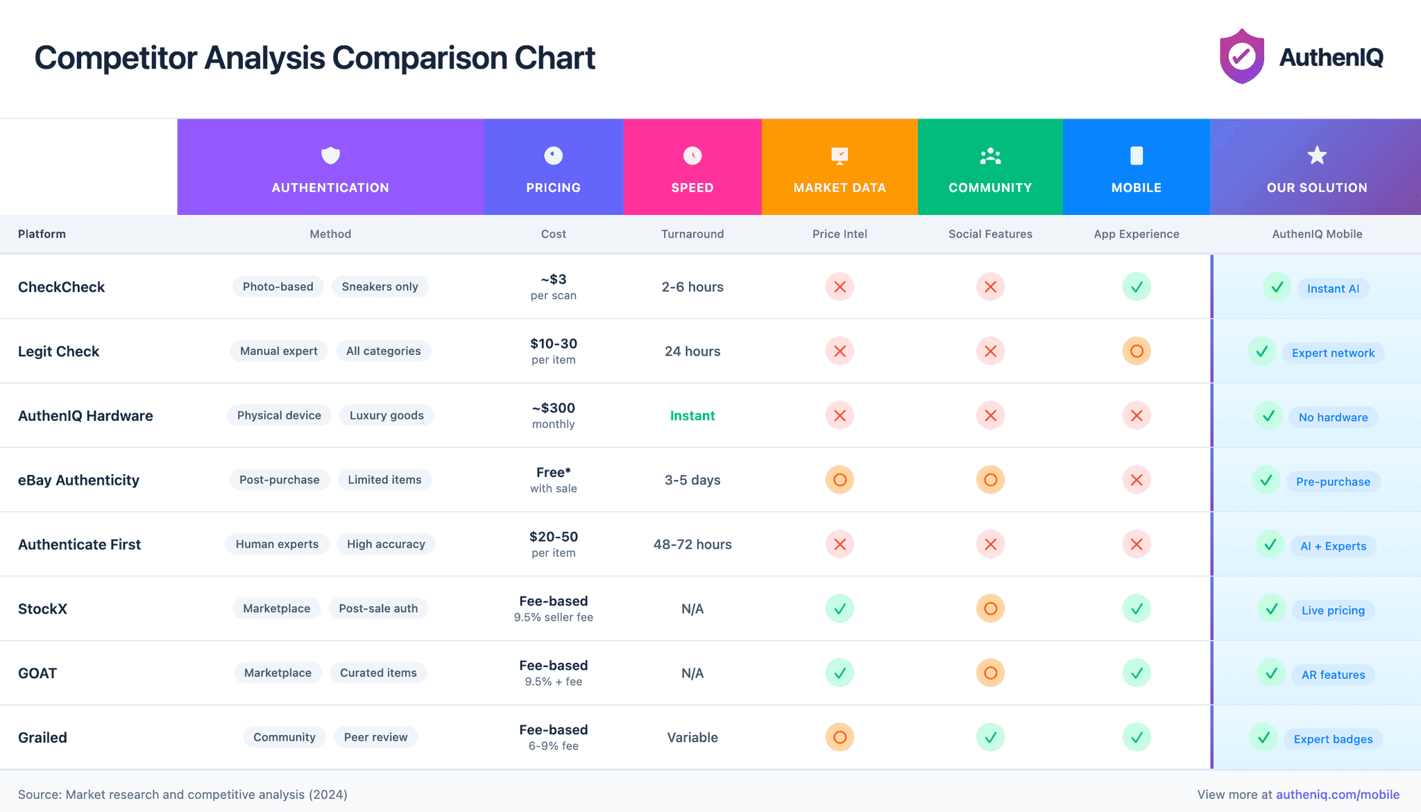
Understanding the landscape before defining our opportunity.
I looked at eight platforms: five direct authentication tools and three adjacent resale marketplaces. Less about comparing feature lists, more about what users had come to expect, where nobody was serving them, and where the app could be genuinely different.
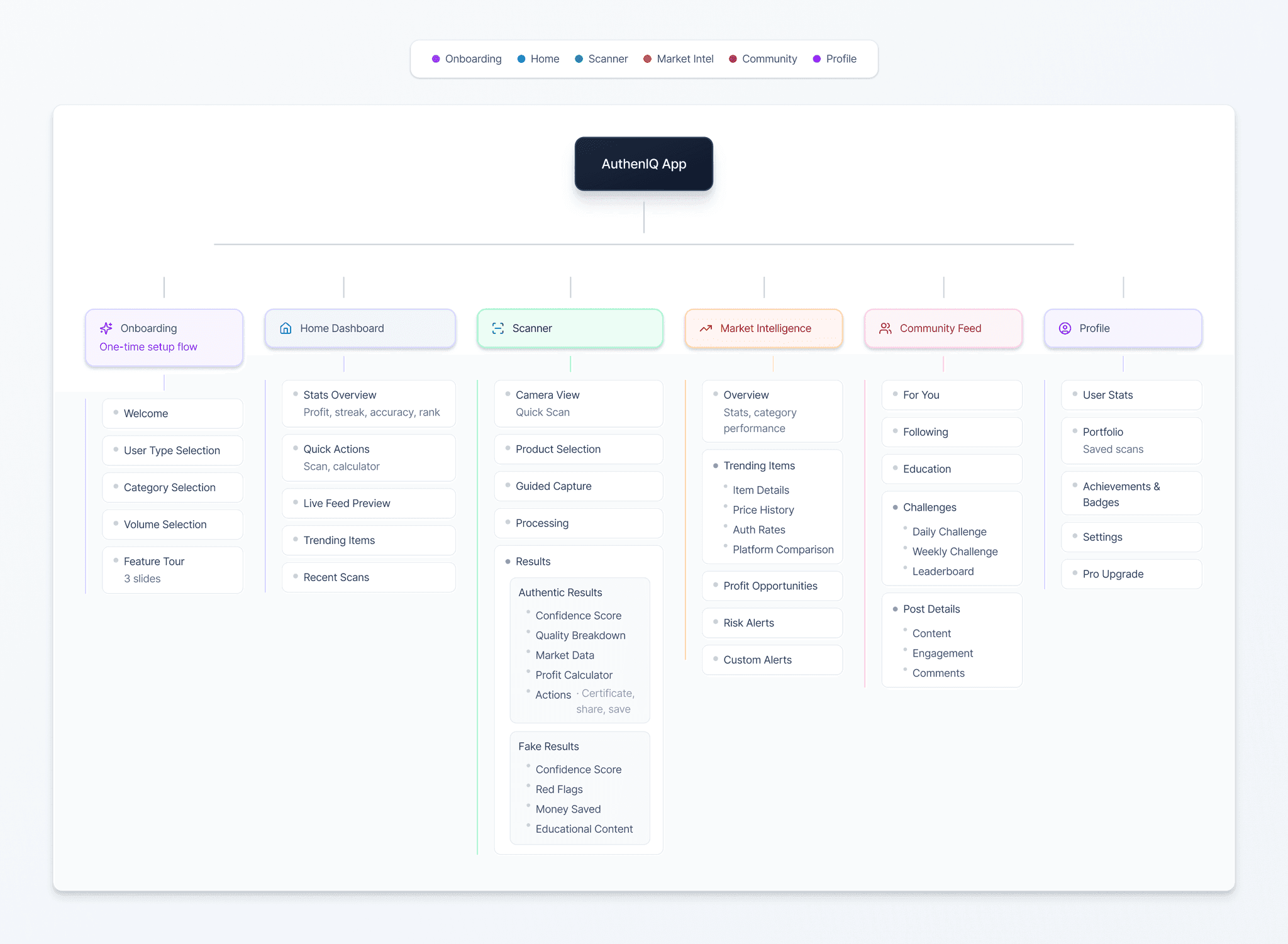
Before jumping into wireframes, I mapped out the entire information architecture. With a small team and a tight timeline, I had to be strategic about where resources were allocated.
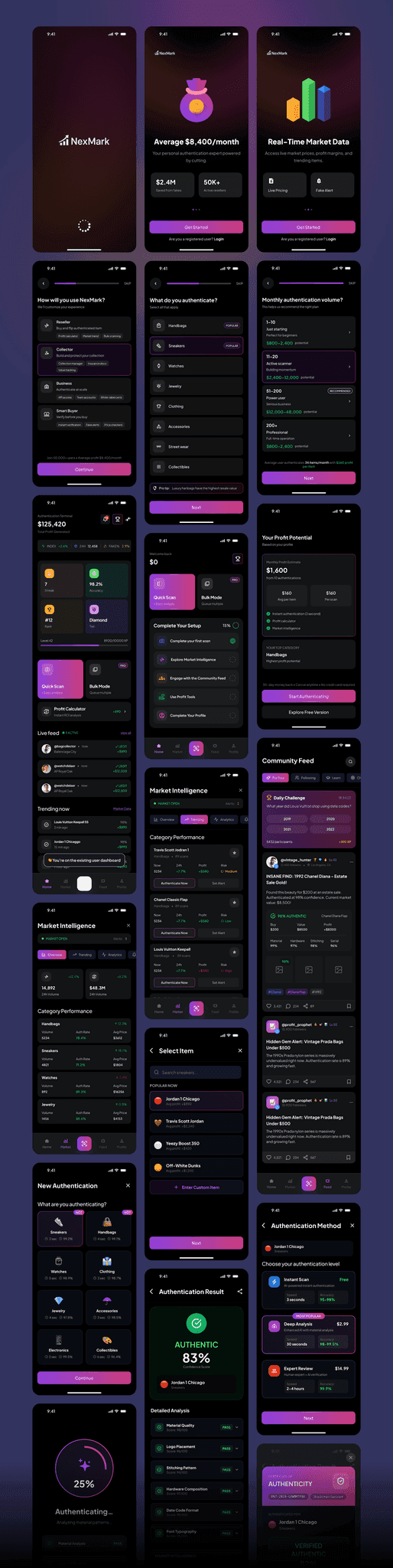
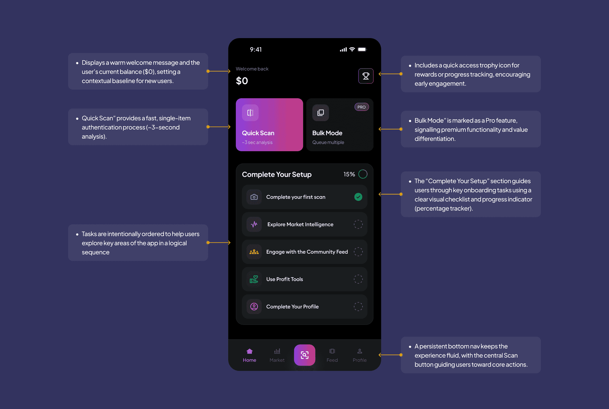
- Onboarding (one-time setup flow): Welcome, User Type Selection, Category Selection, Volume Selection, Feature Tour (3 slides).
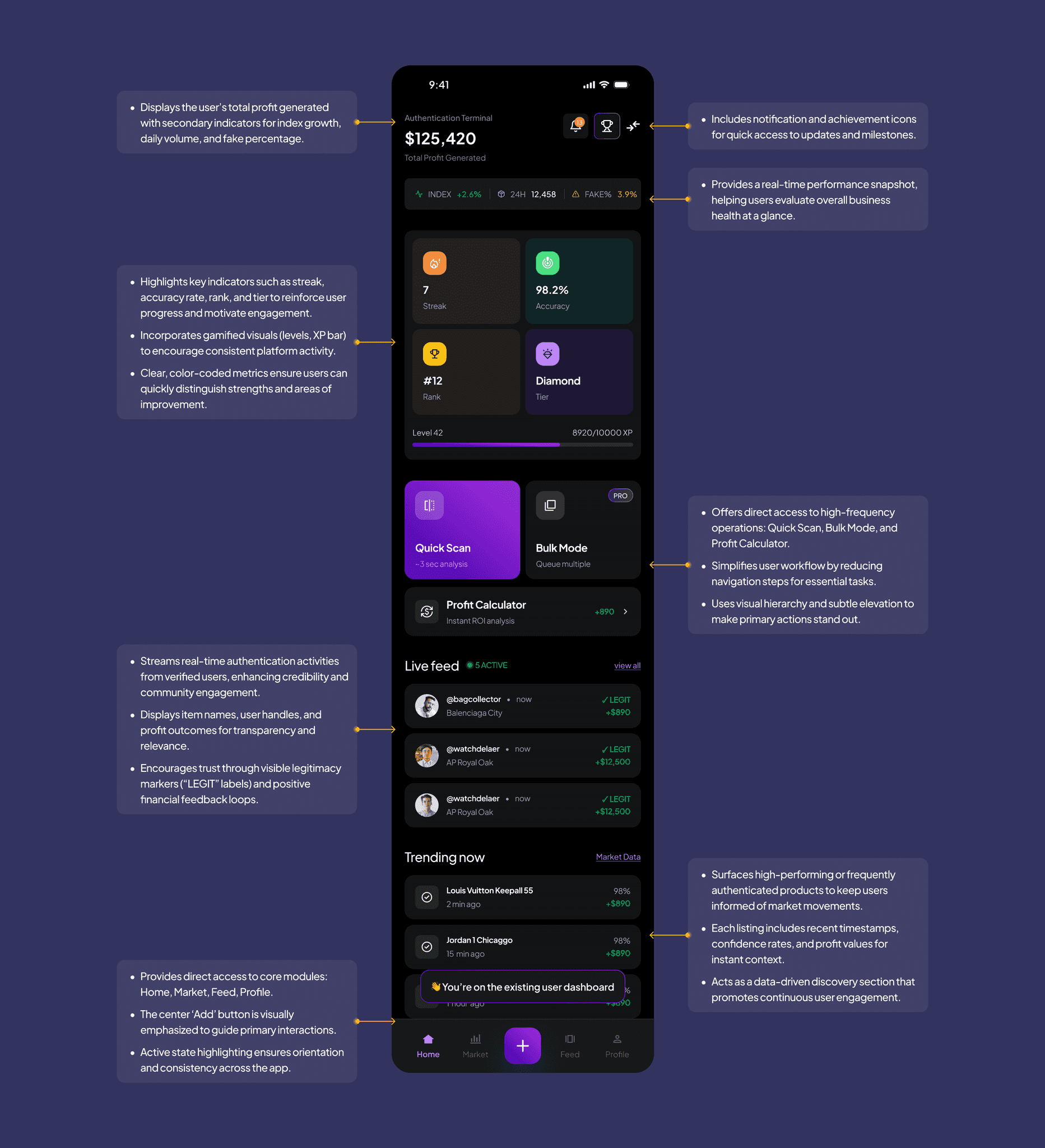
- Home Dashboard: Stats Overview (profit, streak, accuracy, rank), Quick Actions (scan, calculator), Live Feed Preview, Trending Items, Recent Scans.
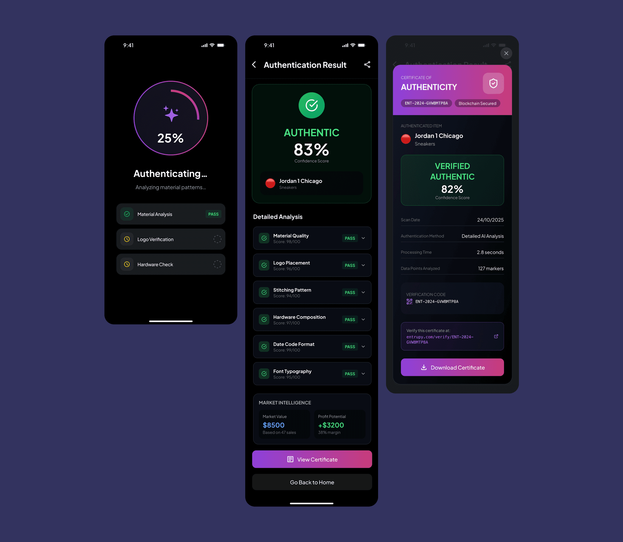
- Scanner: Camera View, Product Selection, Guided Capture, Processing, Results. Authentic results show a confidence score, quality breakdown, market data, profit calculator and actions. Fake results show a confidence score, red flags, money saved and educational content.
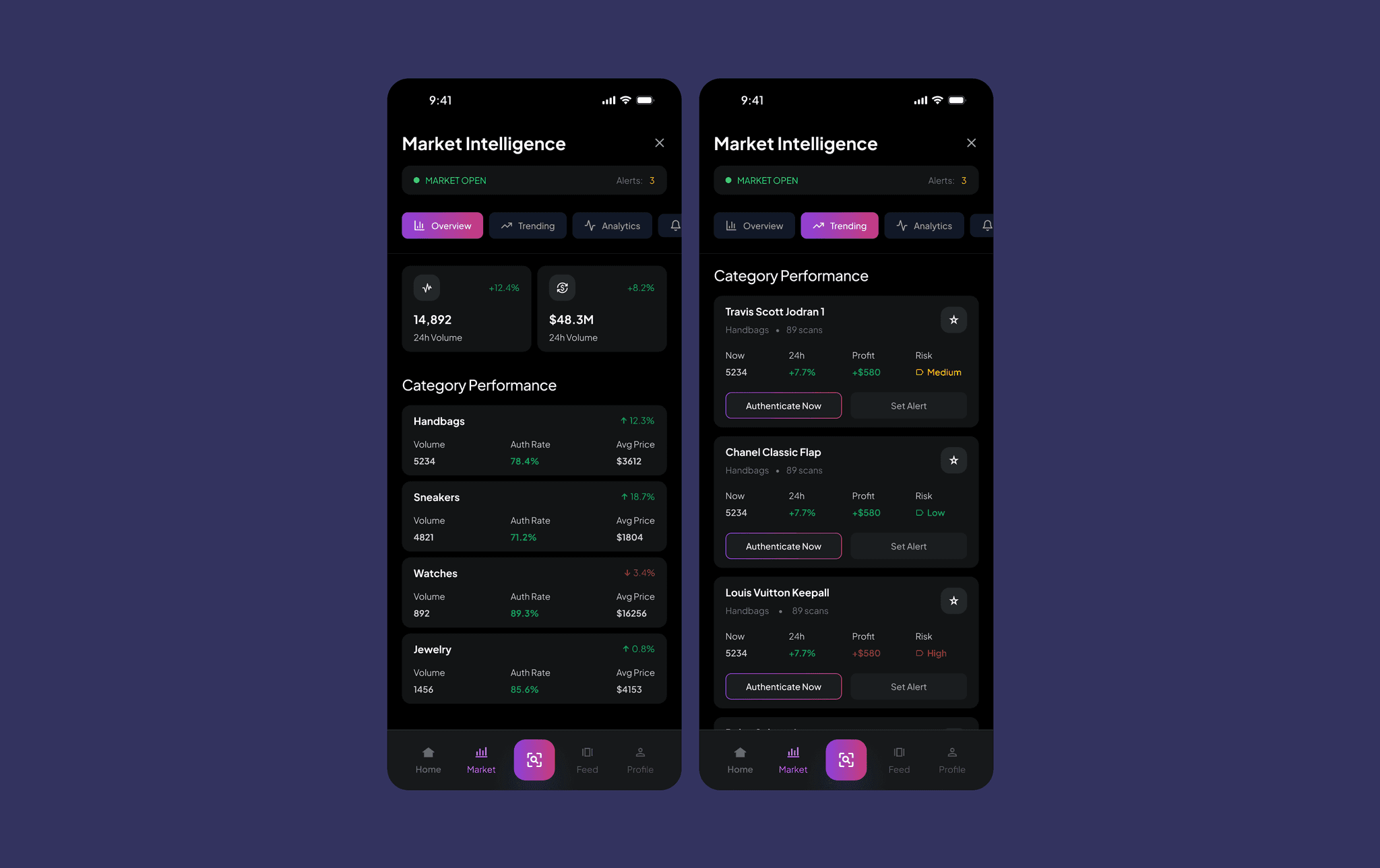
- Market Intelligence: Overview, Trending Items, Profit Opportunities, Risk Alerts, Custom Alerts.
- Community Feed: For You, Following, Education, Challenges (daily, weekly, leaderboard), Post Details.
- Profile: User Stats, Portfolio, Achievements & Badges, Settings, Pro Upgrade.
The guidelines that shaped every decision.
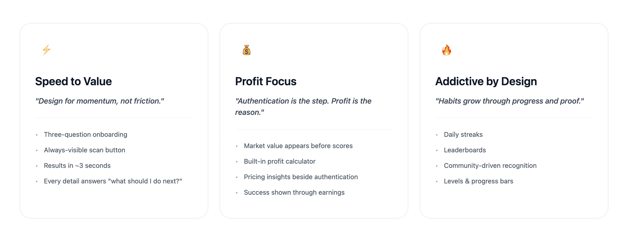
After our research, it became clear that users weren't just looking for an authentication tool, they were trying to make fast, informed, confident business decisions. To keep us aligned, I defined three design principles that served as our compass throughout the project.
Each principle acted as a guardrail whenever we had to make tradeoffs, ensuring the final product supported how resellers actually work.
- Speed to Value: "Design for momentum, not friction." Three-question onboarding, an always-visible scan button, results in about 3 seconds, and every detail answers "what should I do next?"
- Profit Focus: "Authentication is the step. Profit is the reason." Market value appears before scores, a built-in profit calculator, pricing insights beside authentication, and success shown through earnings.
- Addictive by Design: "Habits grow through progress and proof." Daily streaks, leaderboards, community-driven recognition, and levels and progress bars.
The three-step onboarding flow introduces features progressively, starting with authentication basics and revealing market intelligence capabilities as users gain confidence with the core functionality.
- 92%
- completion
- 2.3min
- average time
- 3 steps
- to active
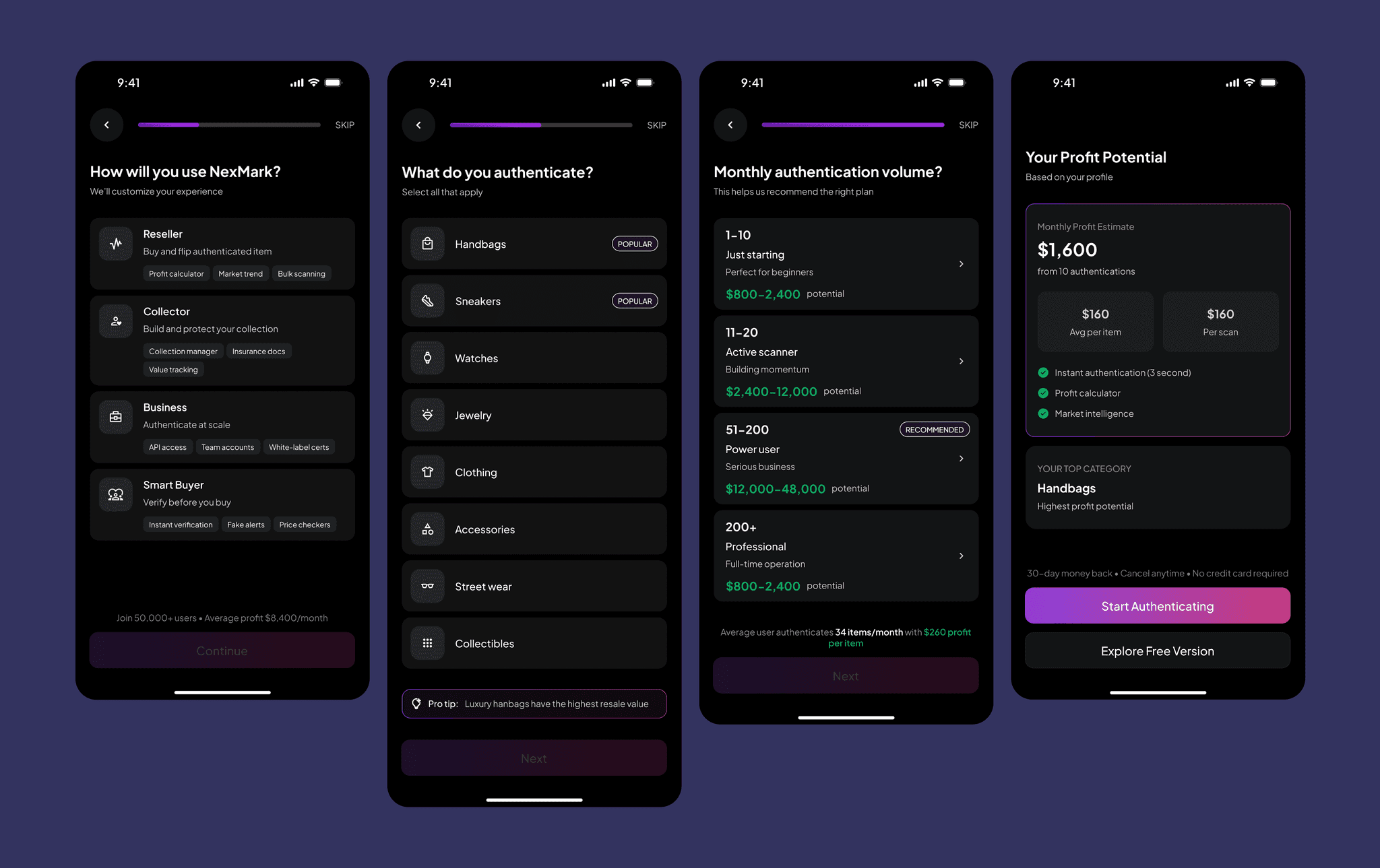
Critical market data appears immediately upon scanning, with profit margins and market values prominently displayed before authentication details. This hierarchy ensures users understand the financial opportunity first.
- $450
- average profit
- 1.8s
- to value
- 78%
- convert
The authentication process shows real-time progress with detailed confidence scores and verification steps. Community validation and transparent scoring build trust in the results.
- 98%
- accuracy
- 4.8★
- trust score
- 12k+
- verified
The wireframes set structure before style: navigation, dashboard metrics and onboarding steps, so we could test whether the flow held up before anyone argued about colour. It let the team validate usability and tighten interactions early, while changes were still cheap.
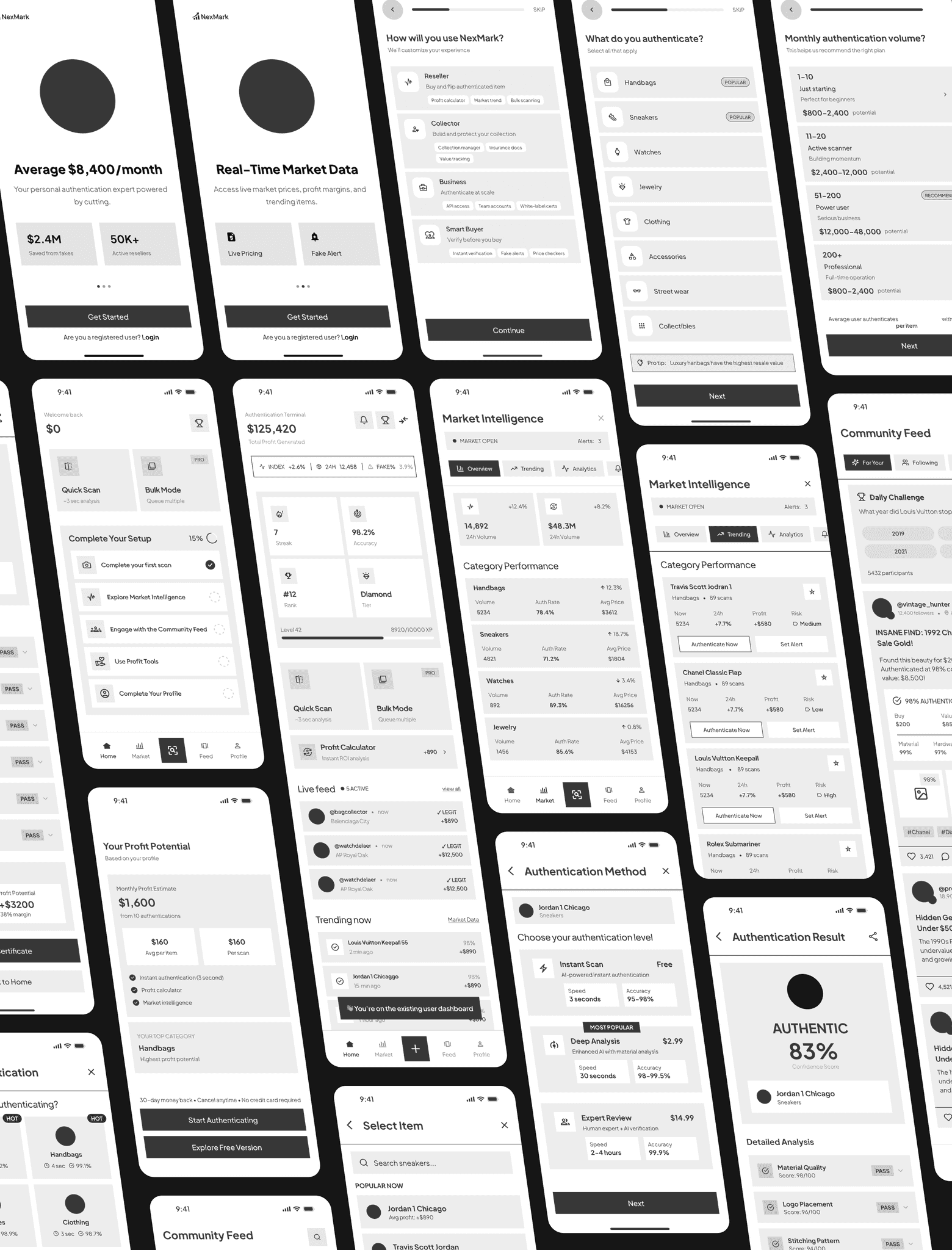
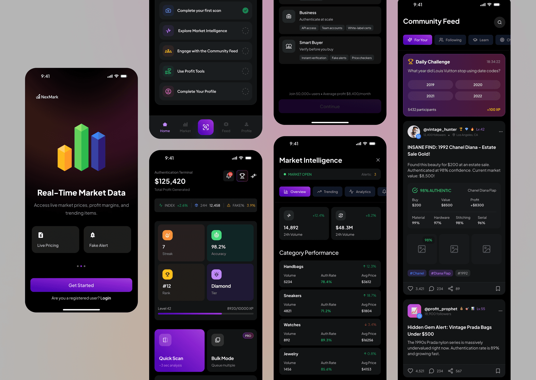
Home is a quick read on how the business is doing: total profit, how many items you have authenticated, and how accurate you have been. Streaks, rank and tier sit alongside that, because the resellers we spoke to are competitive people and it turns out that helps. Underneath, Quick Scan, Bulk Mode and the Profit Calculator are one tap away, and the Live Feed and Trending Now show what is actually moving right now.
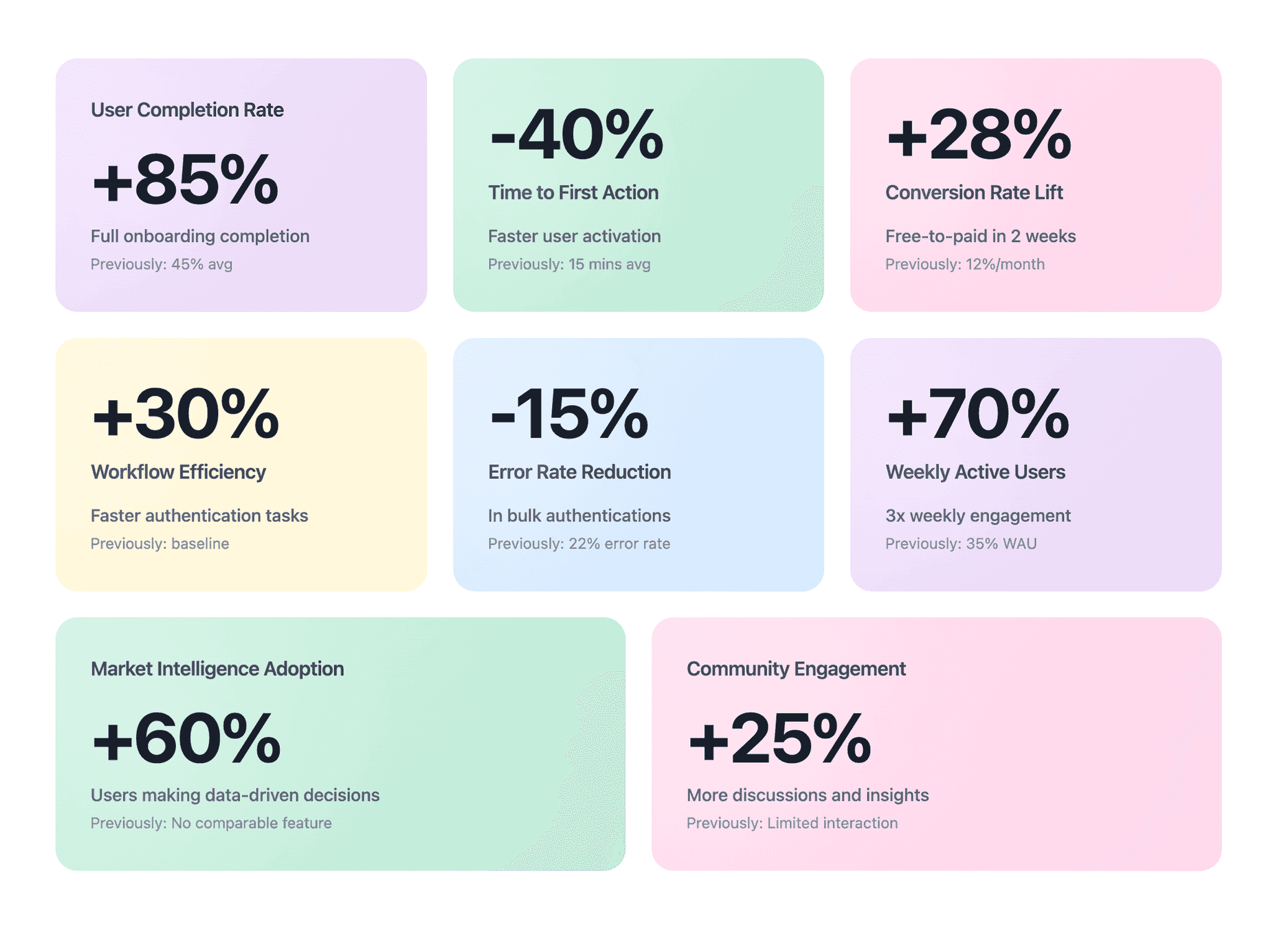
After launch, more people finished onboarding, got to their first scan faster, and hit fewer errors. The new features made it easier to make decisions on real data rather than instinct, and community participation and weekly activity both grew steadily. Onboarding completion rose 85%, time to first action fell 40%, error rate in bulk authentications dropped 15%, and weekly active users climbed 70%. Free-to-paid conversion lifted 28%.
- +85%
- onboarding completion
- -40%
- time to first action
- -15%
- error rate in bulk authentications
- +70%
- weekly active users
- +28%
- free-to-paid conversion