Overwatch Digital health platform mobile app
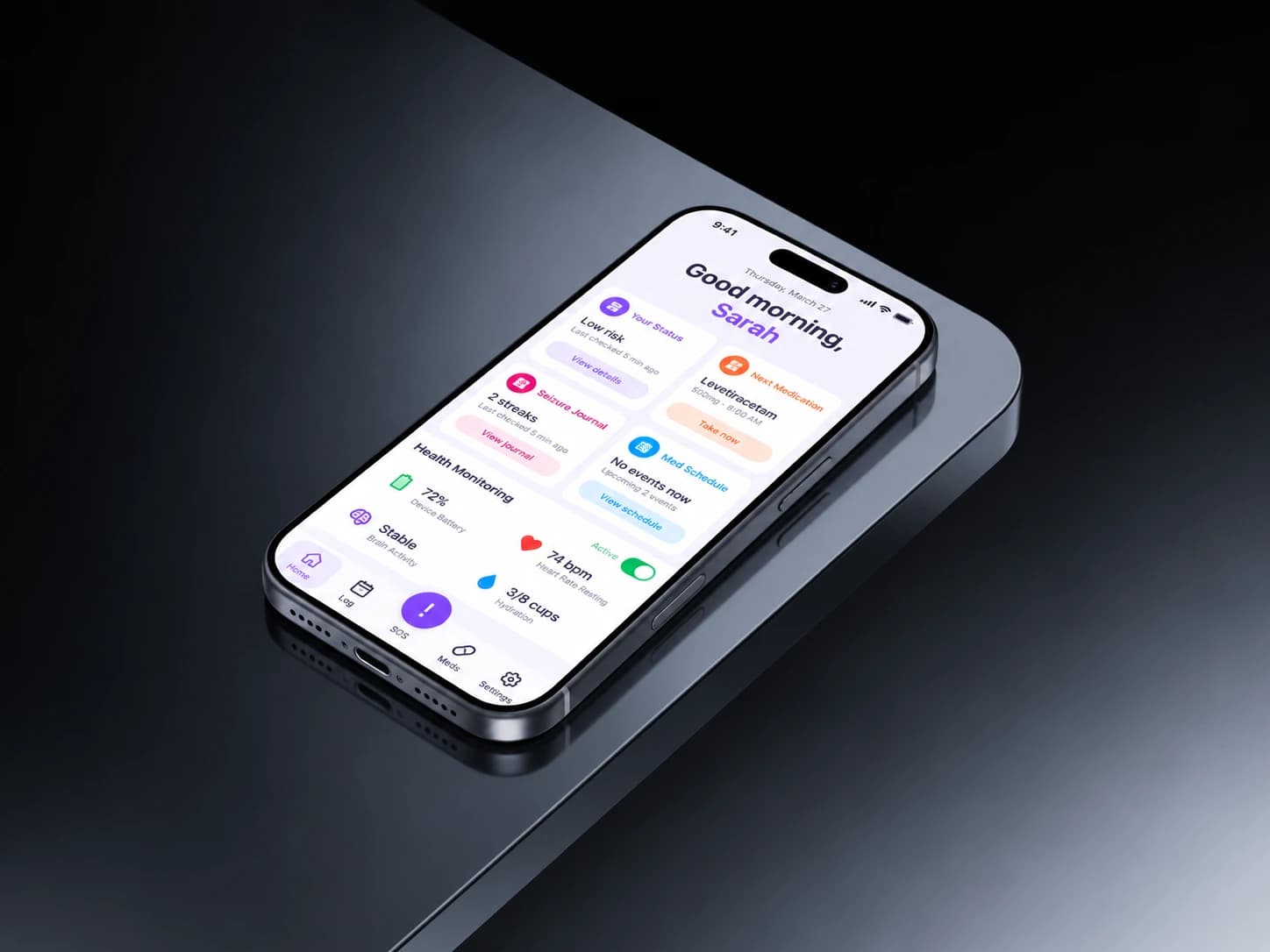
A safety app felt hard to trust.
For people managing epilepsy, unclear alerts and scattered information added uncertainty to an already difficult day.
- UX Designer & Researcher
- 8 months
- Healthcare B2C (mobile app)
- 24% faster caregiver response
- FigmaReact NativeXcode
The app watches for seizures. It uses motion signals, lightweight machine learning and live location to alert a caregiver when something might be happening, so nobody goes through a seizure alone or waits too long for help. It was working, sort of. 6,500 people were using it monthly and 18% of alerts led to a caregiver actually stepping in, which proved it was genuinely useful. But people didn't understand it. 42% told us they weren't sure what the app was detecting, and onboarding lost 31% of new users in the first week. Trust was the design problem, not detection.
I started by talking to people who live with epilepsy and the people who look after them. Those conversations became personas and journey maps, which became wireframes and prototypes. Then a lot of testing, with developers checking feasibility and clinicians checking we weren't implying something medical we shouldn't. The goal was an app people feel confident in, not just one that works.
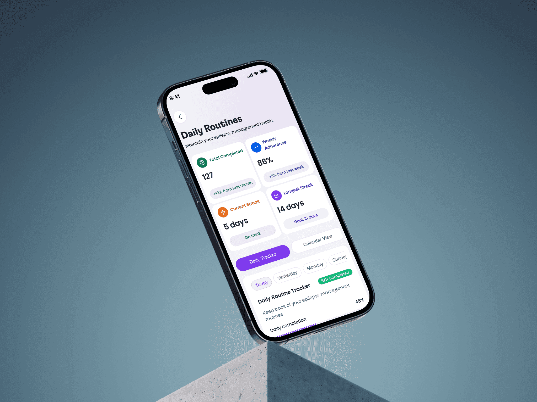
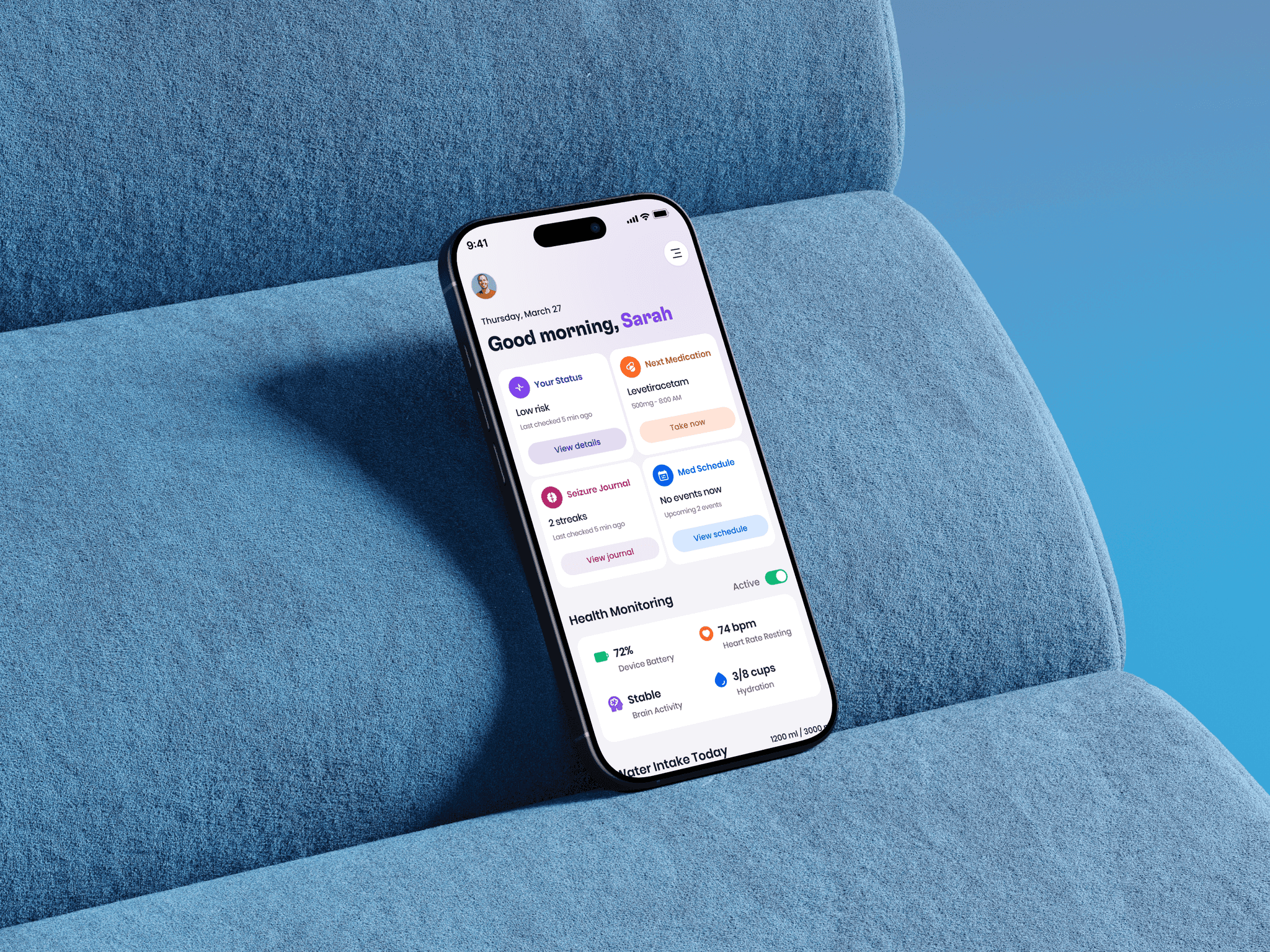
The old screens were mostly walls of text, so you had to read everything to find the one thing you needed. The new version puts the numbers that matter at the top and lets the rest sit quietly underneath. Same information, a lot less hunting.
- 6,500+ active users relying on the app monthly.
- 18% of alerts resulted in a caregiver intervention, validating real-world usefulness.
- 42% of users reported difficulty understanding what the app was detecting, and 31% dropped off within the first 7 days due to unclear onboarding, scattered information, and inconsistent alert feedback.
- 24% faster caregiver response time.
- 36% improvement in user confidence (self-reported).
- Reduced onboarding drop-off by 19%.
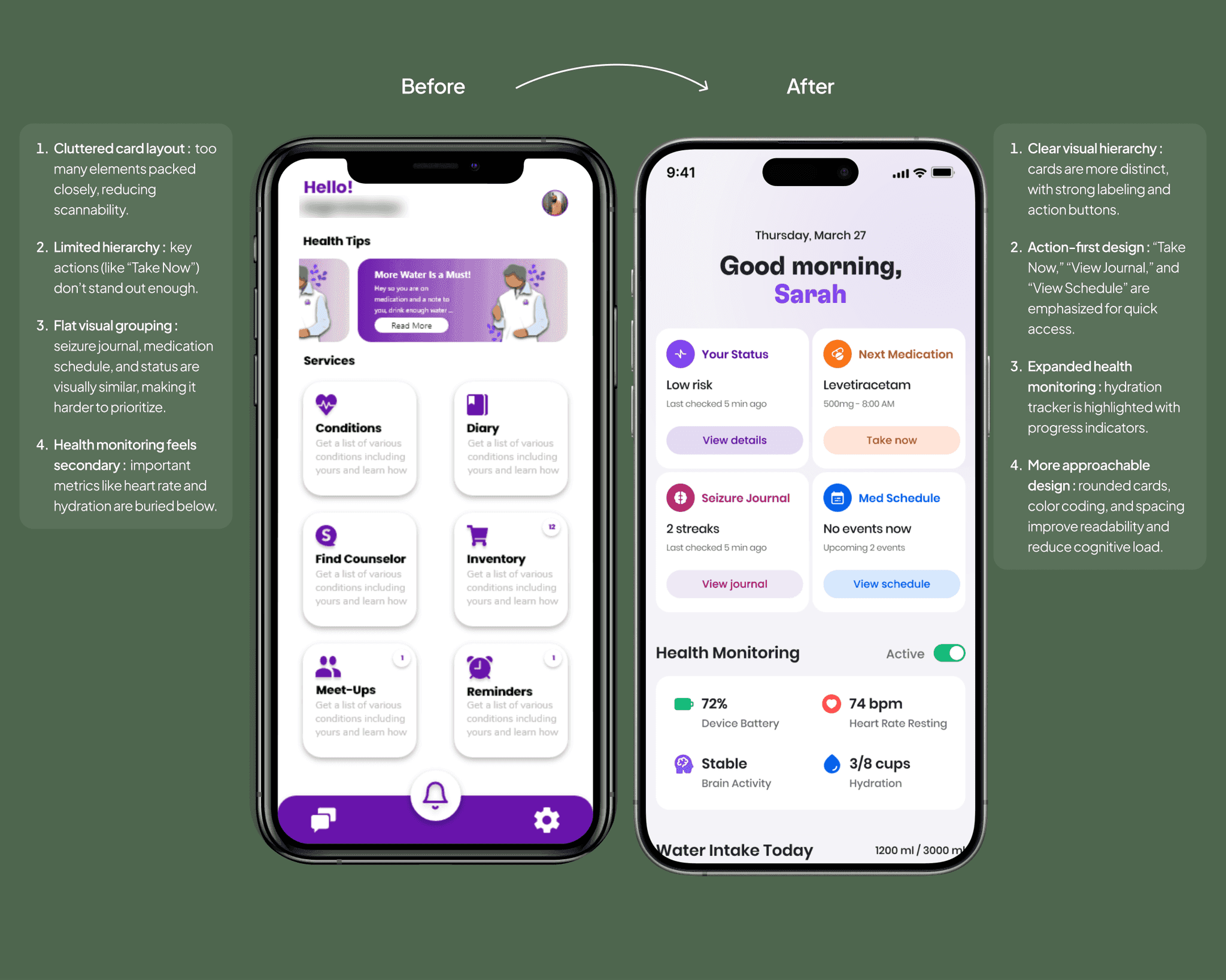
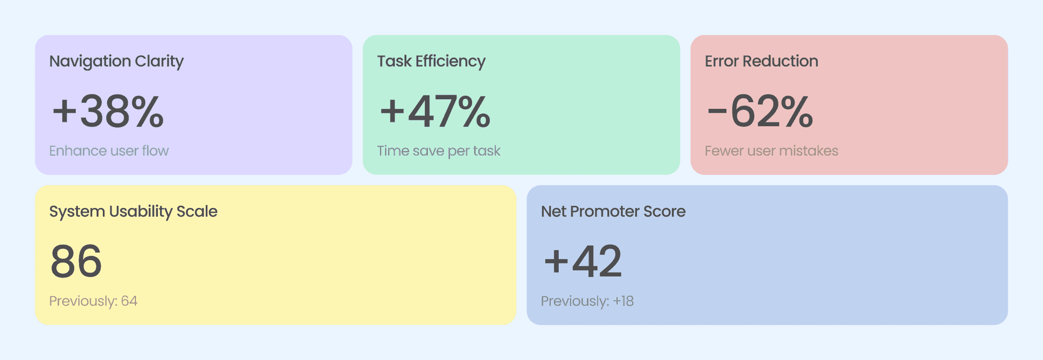
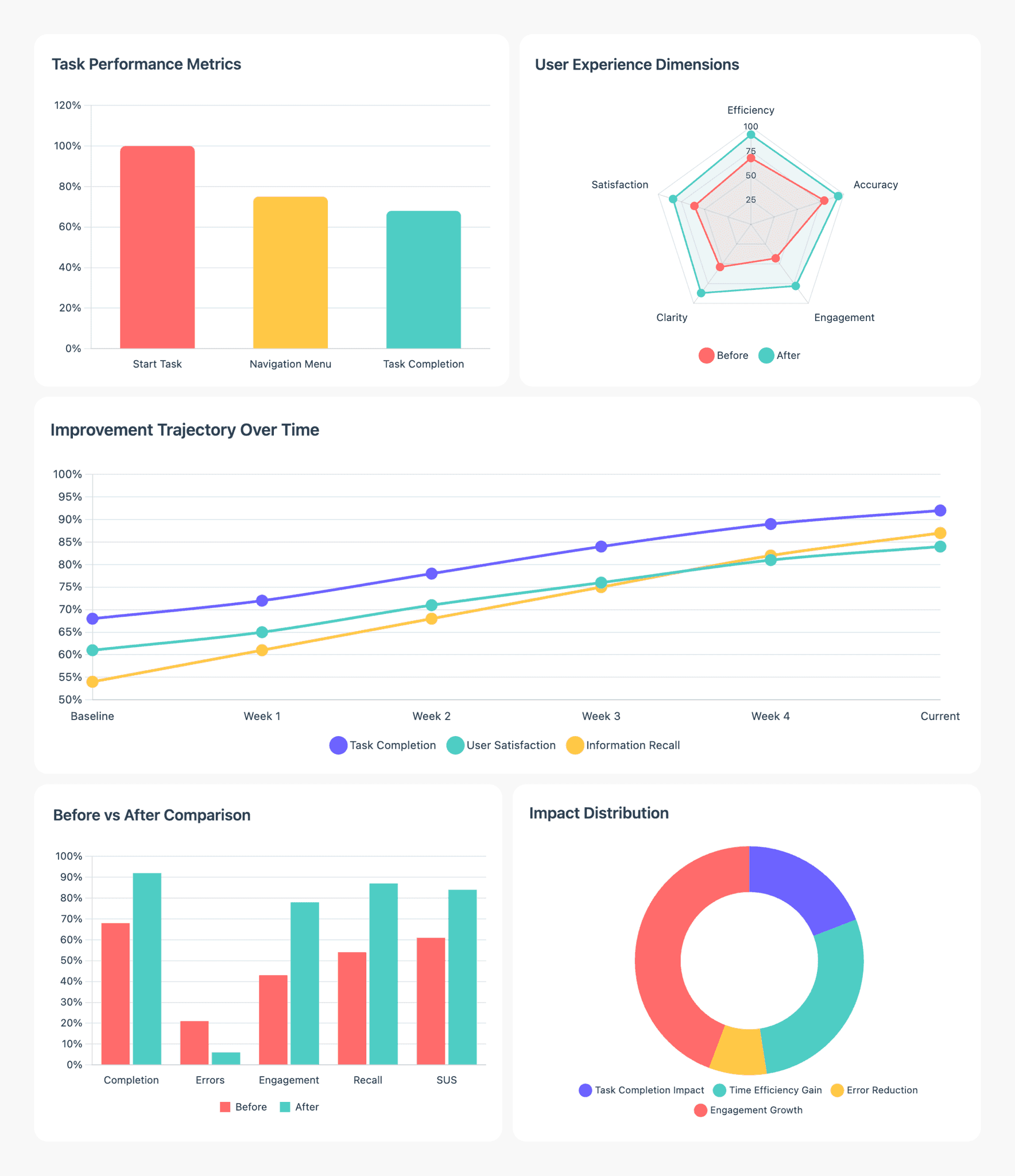
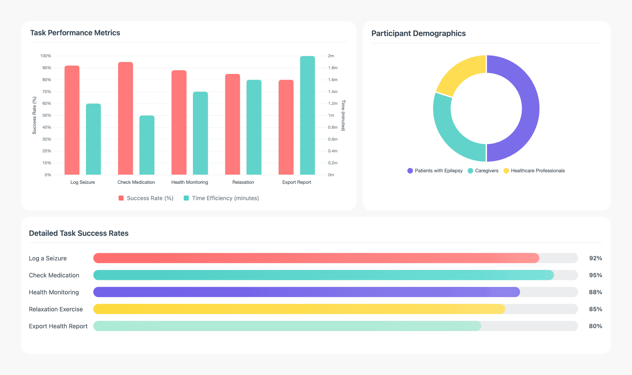
Testing showed exactly where people were getting stuck, and then how much the redesign helped. Task errors dropped to 12% and the average task took 1.3 minutes, which tells me people were finding things rather than guessing. Trust moved too: NPS came in at 76, the highest the product had recorded.
Two small things did come up: a sync lag with wearables and a couple of overlapping elements on smaller screens. Neither stopped anyone finishing a task, but both went on the list.
- 12%
- task error rate
- 1.3 min
- average time per task
- 76
- NPS, the highest the product had recorded
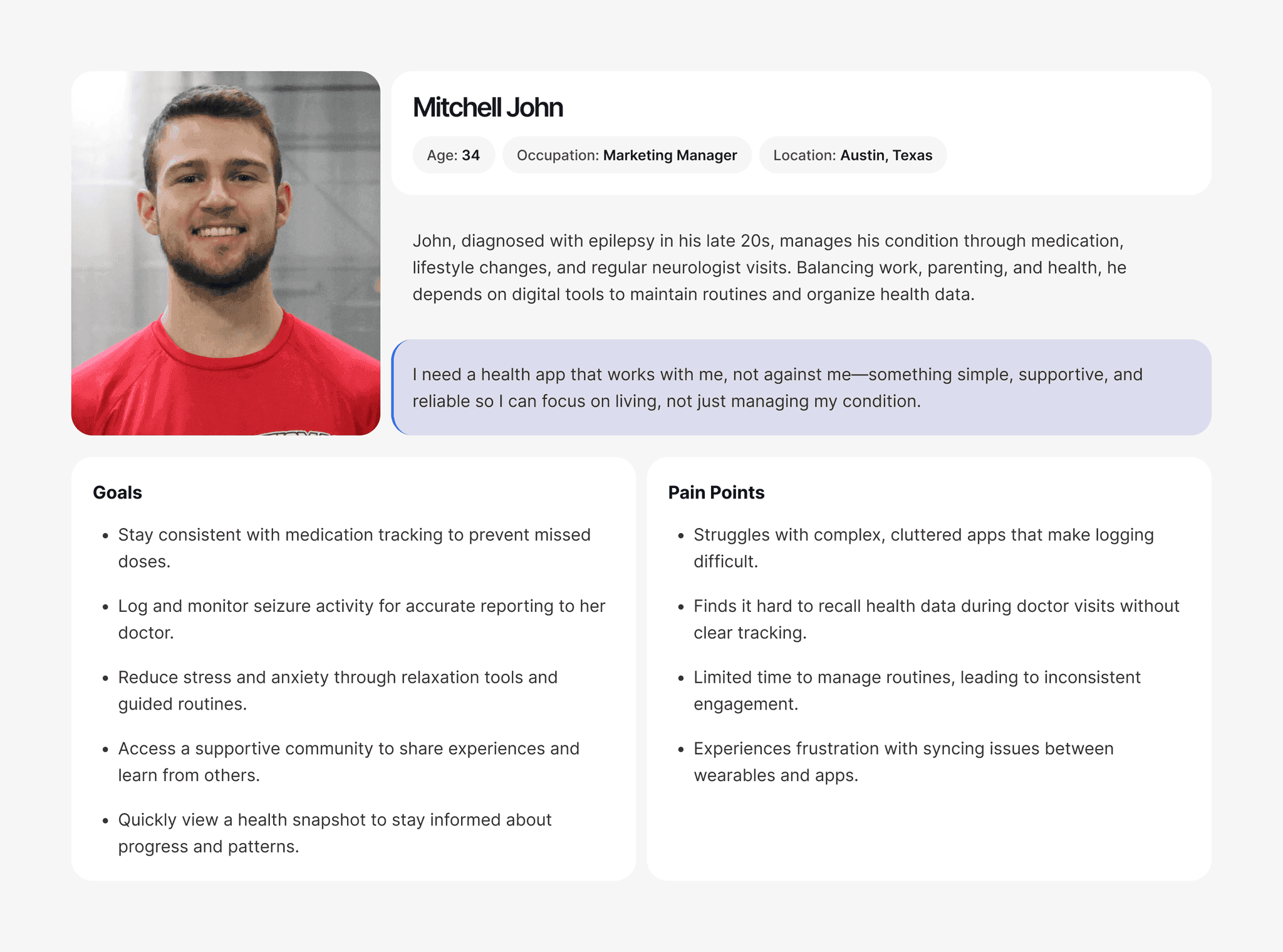
The two personas came straight out of the surveys and interviews, so they read less like invented characters and more like the patterns we kept hearing. They kept us honest whenever we had to choose what to build first: clear symptom tracking, a logging flow that behaves the same way every time, and caregiver support that is never more than a tap away.
- Goal: Stay consistent with medication tracking to prevent missed doses.
- Goal: Log and monitor seizure activity for accurate reporting to the doctor.
- Goal: Reduce stress and anxiety through relaxation tools and guided routines.
- Goal: Access a supportive community to share experiences and learn from others.
- Goal: Quickly view a health snapshot to stay informed about progress and patterns.
- Pain point: Struggles with complex, cluttered apps that make logging difficult.
- Pain point: Finds it hard to recall health data during doctor visits without clear tracking.
- Pain point: Limited time to manage routines, leading to inconsistent engagement.
- Pain point: Experiences frustration with syncing issues between wearables and apps.
The people using the app most were between 25 and 34, and they treated it as part of their morning and evening routine. Getting around wasn't the problem. Reporting a seizure was: too slow, too many fields, too much typing at the worst possible moment. They asked for voice logging, shorter forms and plainer summaries, which was really one request said three ways. Make this take less effort.
- Desired improvements in the seizure reporting process: quicker data entry methods.
- Desired improvements in the seizure reporting process: voice-to-text capability.
- Desired improvements in the seizure reporting process: ability to add more detailed notes.
- Desired improvements in the seizure reporting process: simplified input forms.
- Desired improvements in the seizure reporting process: tutorial or guidance for first-time users.
- 40
- survey responses

The flow follows someone from their very first open through to everyday use: sign up, log in, connect a device and choose how you want to be notified.
After that, the dashboard is home. Medication reminders, seizure logs, daily routines and the calming tools all sit a tap away, along with the community hub, your progress over time, and the people you would want reached in an emergency.
Keeping all of it in one place mattered more than it sounds. In a moment that is already frightening, nobody should have to remember which app the important thing lives in.
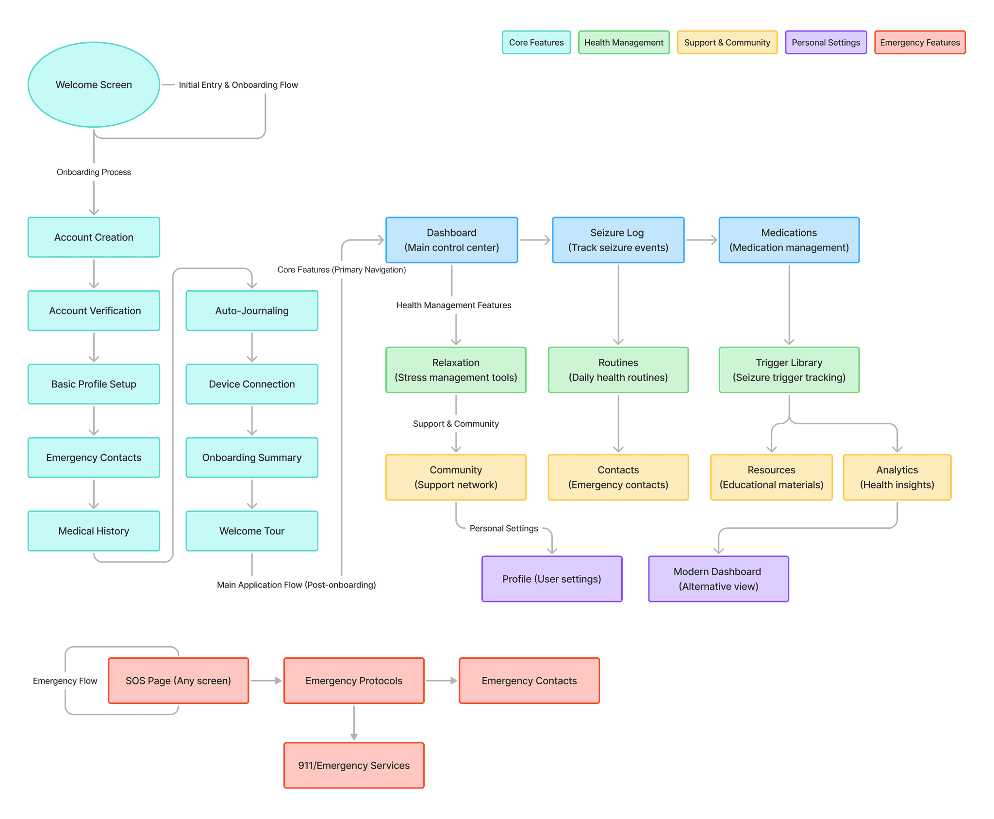
The wireframes were where I checked whether the new structure actually held up: shorter logs, medical summaries you can read in one go, emergency actions you can reach without thinking, and a short hop between your daily routine and what it all adds up to. None of this was about looking good yet. It was about making sure the app matched how people really behave on a bad day.
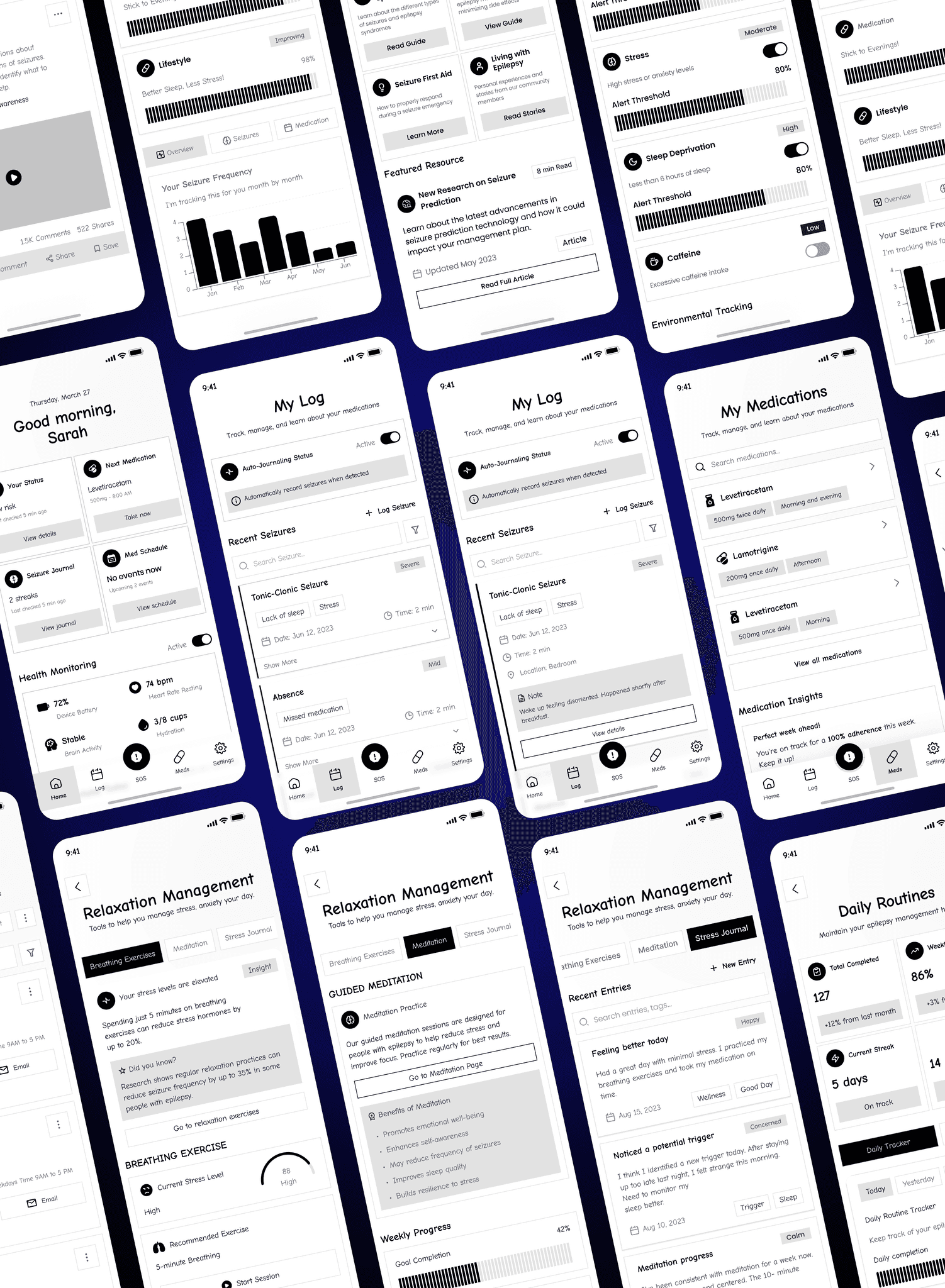
In a health app, being predictable is a feature. I built the components so charts, logs, cards and alerts all behave the same way, which means nobody has to relearn anything as they move around. It also leaves room to grow, so a new clinical feature or a new device can slot in without breaking the readability we worked hard for.
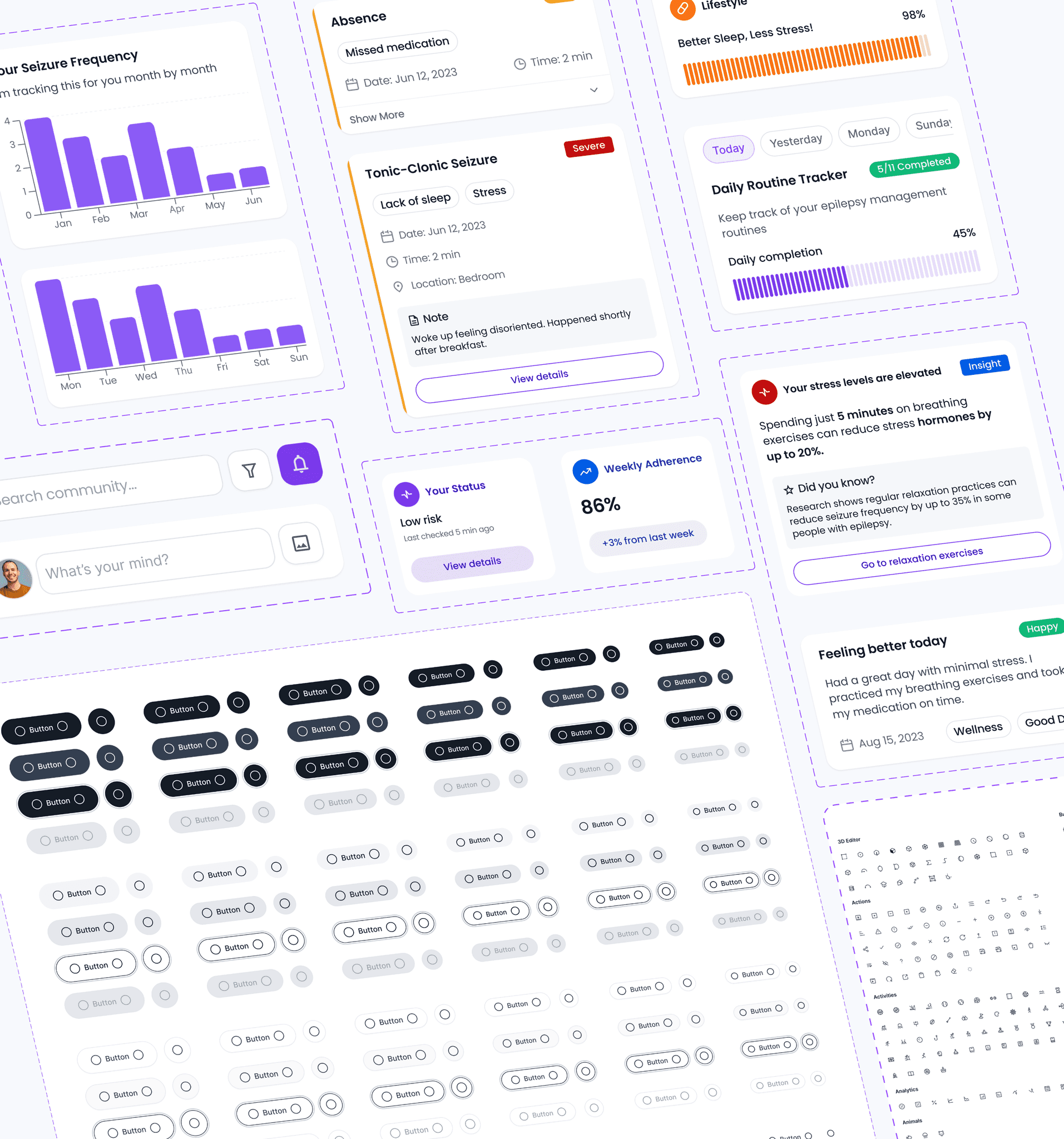
Onboarding had two jobs at once: get someone set up quickly, and make them feel safe handing over something as personal as their seizure history. Five changes did most of the work.
- Clear, welcoming first screen that sets expectations and builds trust.
- Four simple steps that keep progress visible and prevent overwhelm.
- Essential medical details captured only where they directly inform insights.
- Early setup of emergency contacts to ensure readiness from day one.
- Transparent data-sharing controls that reinforce security and user agency.
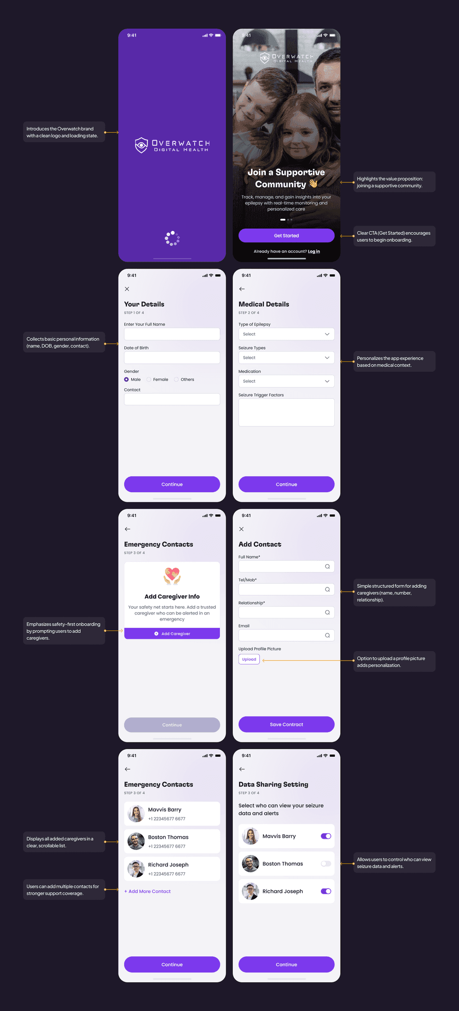
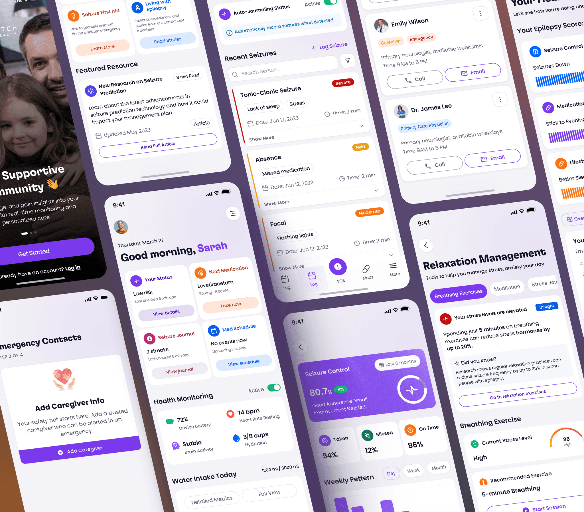
Same tasks, same kinds of people, measured before and after. This is where the redesign actually moved the needle.
- 92%
- task success: log a seizure
- 95%
- task success: check medication
- 88%
- task success: health monitoring
- 85%
- task success: relaxation exercise
- 80%
- task success: export health report
Where the redesign made a real difference: caregivers responded 24% faster, self-reported confidence went up 36%, onboarding drop-off fell by 19%, task errors came down to 12% and NPS landed at 76.
- 24%
- faster caregiver response
- 36%
- higher self-reported confidence
- 19%
- lower onboarding drop-off
- 12%
- task errors
- 76
- NPS